Beach Cottage Renovation Reveal: Dining Room
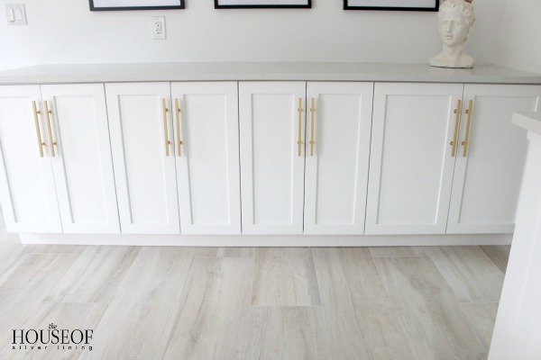
Today is Day 2 of the beach cottage renovation reveal! Did you see the kitchen in yesterday’s post?? If you didn’t get a chance, go check it out HERE. The transformation is profound. Yesterday, I left you with this image of the cabinets extending from the kitchen into our dining room.
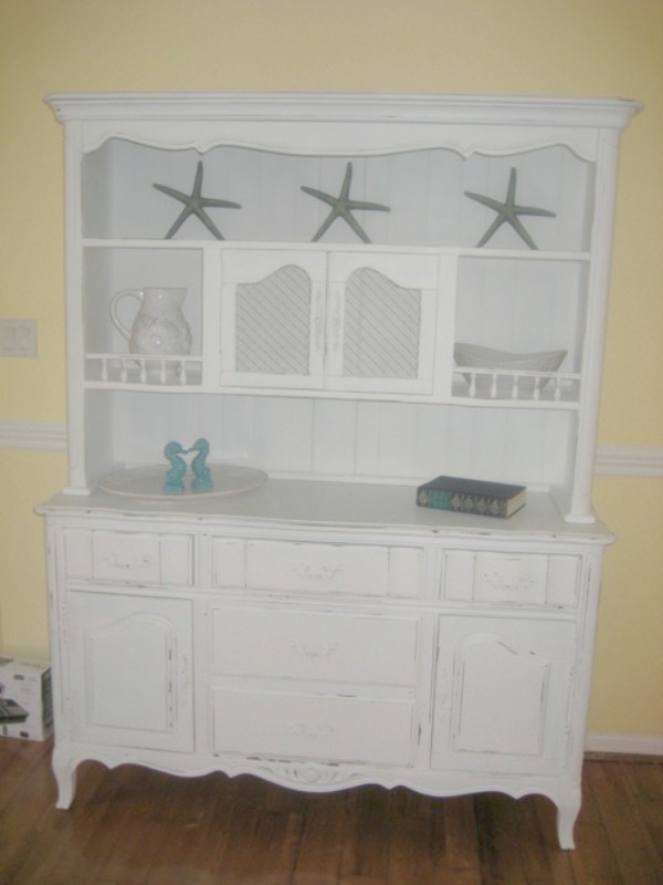
Once again, you get to see the BEFORE renovation to appreciate the transformation. This old hutch was one of the first pieces of furniture I bought for the cottage when I would spend days scouring all the antique shops and second hand stores in Naples. Although it’s not “my style” anymore, I’ve held on to it and moved it into the family room. Repurposed it a little and still loving the sentiment it holds.
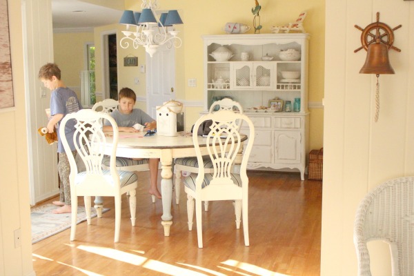
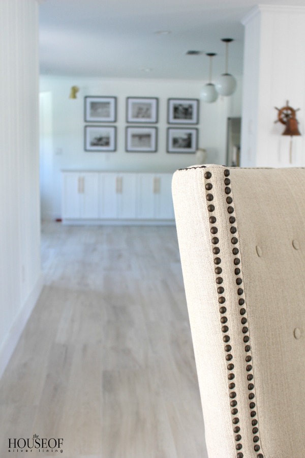
As you can see the “dining room” is really a walk through or passageway from the front living room, moving past the kitchen on the right, and into the large family room. The doors to the left of the table lead out to our large pool area. This is one of my favorite little spots to sit in the morning sipping coffee and looking out at the pool and the beautiful yard. So the “before” look wasn’t bad at all. You can see the original hardwood floors from when the house was built in the 60’s. They were in great shape, but just as you turned the corner into the kitchen or went a little further into the family room was the big honker mexican tiles I showed you yesterday. Bleh! Adding new light driftwood floors throughout just really opened up the space!
Also, notice the chandelier is off center in this area. We had to keep the dining table centered underneath which was actually too tight next to the patio door. That went bye bye too and recessed lights were installed to keep this walk through open and give us more flexibility of table placement.
I’m not anti-yellow, but I realized that this space looked like a banana or a canary even. Too much yellow going on. I know we’re in Florida here, but good grief that yellow was starting to nauseate me! Funny thing is that the walls were all white when we originally bought the house and the first thing we did was paint the family room/dining room yellow. Now we are full circle back to where we began…white walls, but in a little bit more modern fashion. Are you ready??
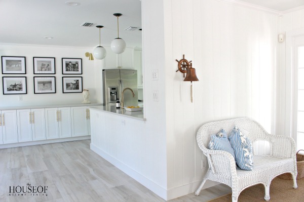
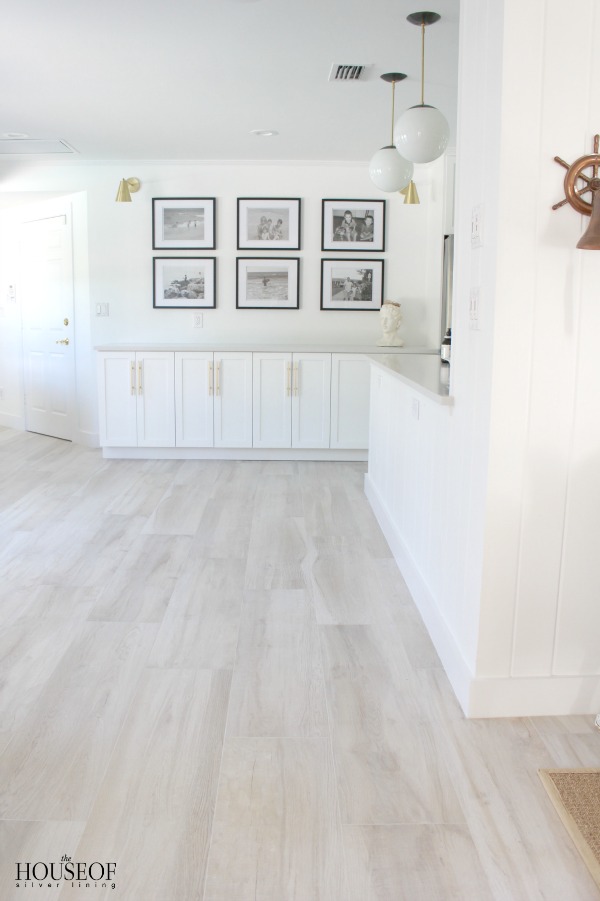
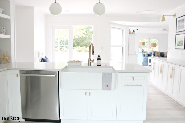
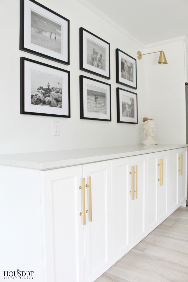
By extending the cabinets into this space, I now have so much more storage and it feels like an open continuation from the kitchen. Having the upper cabinet wall knocked out where the pendants are now hanging just dramatically opened up these two rooms that once felt separate from each other.
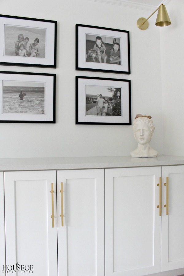
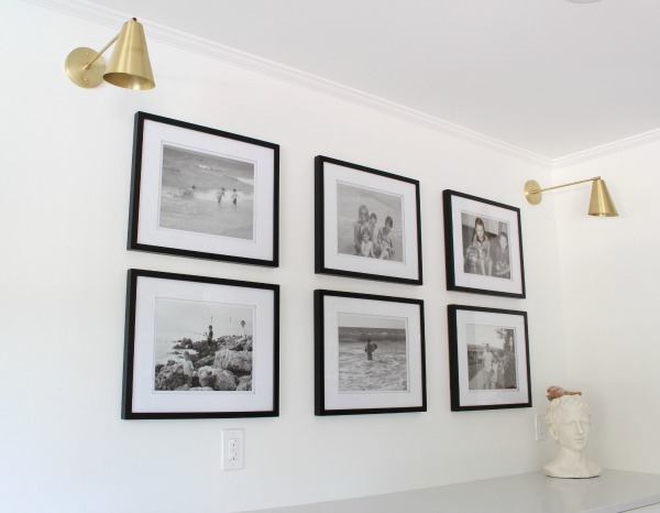
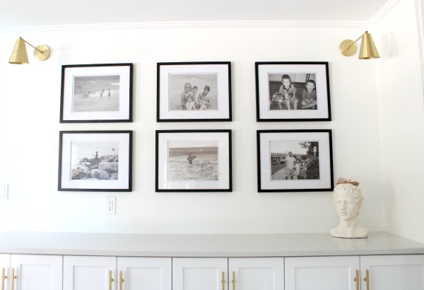
When I was figuring out this wall and the cabinetry, I didn’t want it to look like just a long row of cabinets thrown in as an afterthought. We didn’t need upper cabinets since we already have plenty of storage so I decided to make it a gallery wall. After getting rid of almost all the previous decor we had in the home including cutesy beach signs, I’ve been determined to decorate with purpose and meaning. Family photos have always adorned my walls and those are the constant of my home. Decor may change, but those precious faces of my boys caught in candid moments are priceless to me. I’ll never tire of that kind of “art.”
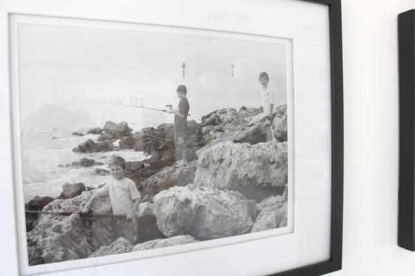
I went through old photos of our first few trips to our cottage and found these photos that pretty much sum up what we do in Florida. A whole lot of beach and fishing. Well, actually, I don’t fish as much as the boys. I prefer a good book and a lounge chair. A sangria too.
These rocks are at the end of our beach and it’s where the boys love to come. I uploaded my “unedited photos” to Walgreens and within an hour I was able to pick up my 11 x 14 prints. I love that convenience! I printed these photos in their raw form, no editing. I love the grain in them, obviously taken from an old camera, but still. The simple black frames with white matting are from Bed Bath & Beyond.
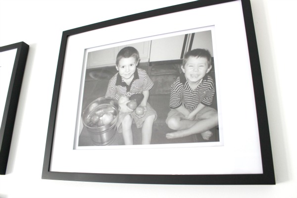
I could just reach into this picture and squeeze those cheeks! Love this one of my younger two beaming with excitement at all the fruit they gathered from our avocado and grapefruit tree. Time please slow down….they are growing up at lighting speed and mama is just not ready!
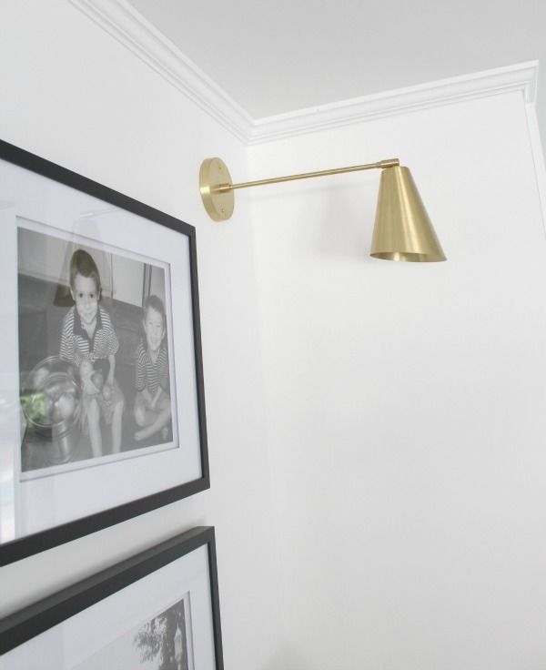
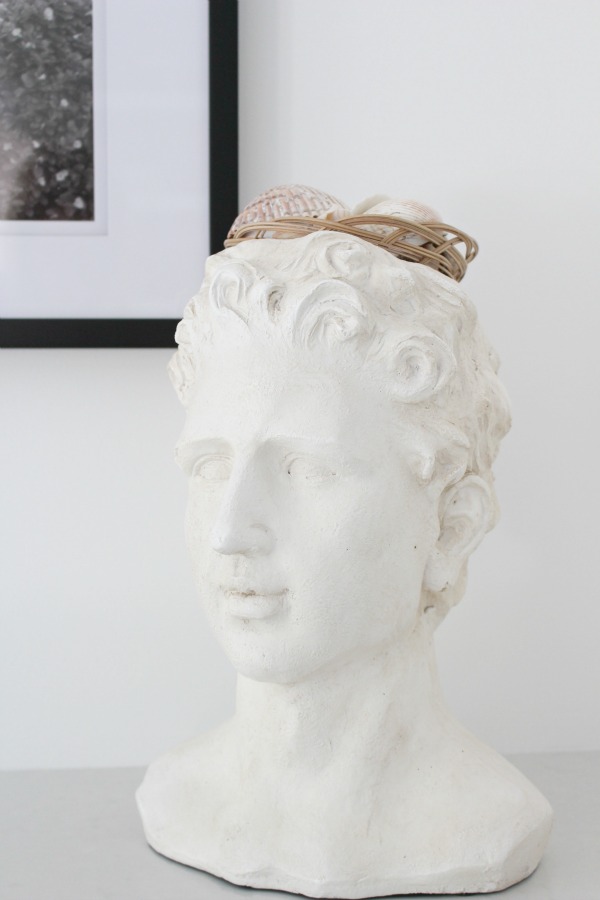
I’ve been in love with the library sconce look for a long time. When I came across these brass sconces I couldn’t wait to get them hung! This wall turned out to be quite a statement, but also a nod down memory lane. I love my little statue head and his crown of seashells gathered by the boys off our beach.
I haven’t found the right table for this spot yet. I’m definitely going with a rectangle shape which is more conducive to the flow of the room. I’m thinking black metal chairs and maybe a bench. Fabric covered chairs are not an option since often times we are strolling in from the beach or pool with damp swim suits. This home has been very casual and livable all these years. I’m not about to change that. I’ll be sharing more of this space as it evolves the next couple of months with new furniture. For now though, THOSE FLOORS can just be fully exposed because I LOVE THEM!! Can you believe they’re tile?? Seriously I could have been fooled. They feel like raw driftwood, like I may get a splinter in my toe kind of driftwood. Tile was the best choice since swiming pool water and sand from the beach are not hardwood floors best friend. Speaking from experience, this I know.
So what’s next this week? Tomorrow I’ll flip the camera around and show you the living room. There’s one thing in particular that makes this room WOW! You’ll have to come back to see!
You can see the beach cottage home tour from this past summer HERE.
Room Sources HERE
Reveals still to come: Living Room|Master Bathroom|Guest Bathroom|Boy’s Bedroom|Powder Bathroom|Exterior




Truly amazing! Love seeing the transformation on IG and here too!
Thank you so much Darrielle!
Ok- totally nuts. I just can’t wait for next week!! Shauna, this is stunning.
I love your excitement Kelley!! I’m still saving the best for last! 😉
xo
What a beautiful space!! And I LOVE your tile floors! I also have tile floors and love them (so easy to maintain) but love the look of wood…I’m saving this idea for a future home reno / new house idea! 🙂
http://www.thoughtfullystyled.com
Thank you! The floors look and “feel” so much like wood! Very happy with them so far!
Love the floors and everything looks so good!!! Can’t wait to the see the table 😉
Thanks Jessica! I think you need to come see the new table in person!;)
xoxo,
Shauna
It’s perfect! You have done and amazing job and the continuous cupboards is a genius touch my friend! Love it! Tam xo
Thank you Tam! So glad you like it! Means a lot coming from you my fabulous designer friend!
xoxo,
Shauna
Those pictures of your boys! Love them so much. And the floors are beautiful Shauna! I have tile that looks like wood in one of my bathrooms and absolutely love it. Such a gorgeous and smart choice for a beach home. Can’t wait to see it in person someday! 🙂 xo
Thank you Erin! I think the framed photos of my boys are one of my favorite parts of the new look. So priceless to me! Now pack your swimsuit and come visit me here!!
xoxo
Would you share the floor tile brand name, color and store purchased from?
The floors are called Albero 3 Nutwood 12 x 48″ porcelain tiles. I wish I remember where our contractor ended up getting them from since they are a special import. Feel free to email me if you need me to track down that info for you further: thehouseofsilverlining@gmail.com
Thx!
Would love to purchase the file your speaking to above. Where would I find it?
Hi Lisa! The porcelain tile I put in our beach cottage is called Albero 3 Nutwood in 12 x 48.” Unfortunately I no longer have a source of where to purchase it since my contractor had to special order it from a distributor out of New York. If you google search the name however, you may be able to find an online source. So sorry that isn’t much help for you.