Intentional Styling + My Thoughts on The Perfect Home
Hello! My oh my where did summer go?! Maybe it’s because we were basically moving all summer long, but it literally feels like I blinked and school is back on. I’m so ready for schedules again and getting back into a normal routine around here. I feel like the past 2 years of my life have been at such a reckless pace and I’ve missed the old me, the old life, the old norms. We are finally getting settled into The Forest Modern and now I’m ready to get busy decorating!! I have a confession though…I’ve been struggling with finding the motivation to finish just one room. Why? Good question! I have a lot of words to say about intentional styling and my thoughts on the perfect home. I sense a novel coming, grab coffee or wine.
*Affiliate links used for your shopping convenience. See our disclosures policy HERE.
Yesterday I posted on Instagram this photo of my “in progress” office. One little corner where the shelves look perfectly styled. Gives you the impression that everything looks this clean and pretty in the whole room, right?
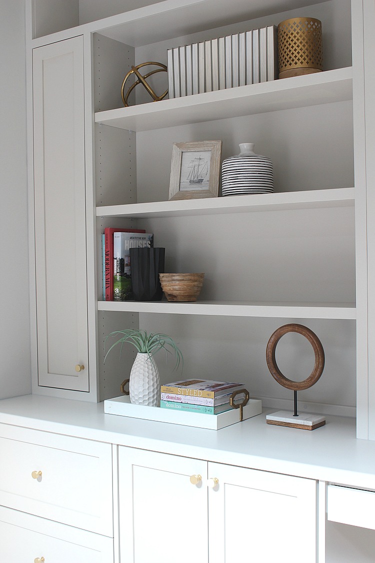
Then I proceeded to ask who is interested in seeing photos of the design journey more so than the “finished product.” Truth is, not one room in our new home is styled and furnished completely and I’ve struggled with showing empty rooms to my audience. In response to my question, you all said exactly what I have been feeling! We are all tired of seeing the perfectly styled “magazine worthy” photos on Instagram, over and over again!!! There! I admitted it! And I’m GUILTY!
In my defense however, and all of the other designers, interior stylists, and everyone else who uses Instagram as a platform to share their work, we need to show pretty photos. That is how our work gets recognized. But what I find missing more often than not is the stages of decorating a home. The life that happens in the home. The out of place chair or the wrinkled bed. I don’t even make my bed! Soooo guilty here! What I read from everyone’s comments in that Instagram post is that you all want to see the start of a design, the middle, the messy, the hiccups, the process, the journey. You want to understand and know my design thoughts and reasonings and hear me process through and even struggle in decorating and designing. You want to see more of the imperfect and less of the perfect. More authenticity.
I hear you! I had one of those “come to jesus moments” with myself yesterday and realized I had lost my way in the reason why I started this blog in the first place. Of course, I want to portfolio the work I do, but I am also passionate about sharing my design process and taking you on the journey as I renovate or simply design a space. I got so caught up in feeling like every room in this house needed to be a BIG REVEAL with drum rolls! Reality is, it’s going to take a long time getting every room done at The Forest Modern and I’m just dying to show you some unseen spaces now! Here are a few…
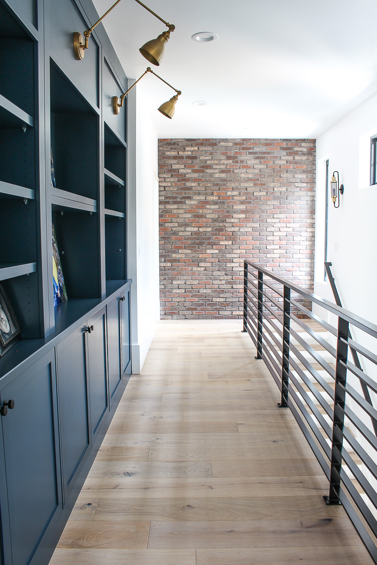
I LOVE this hallway upstairs so much! Dying to style those shelves but for now they have just a few family photos. Perfect.
And this area is probably the best part of the home…
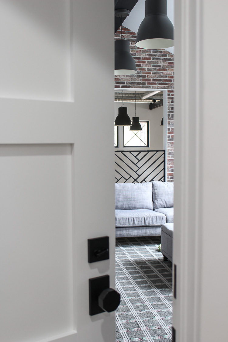
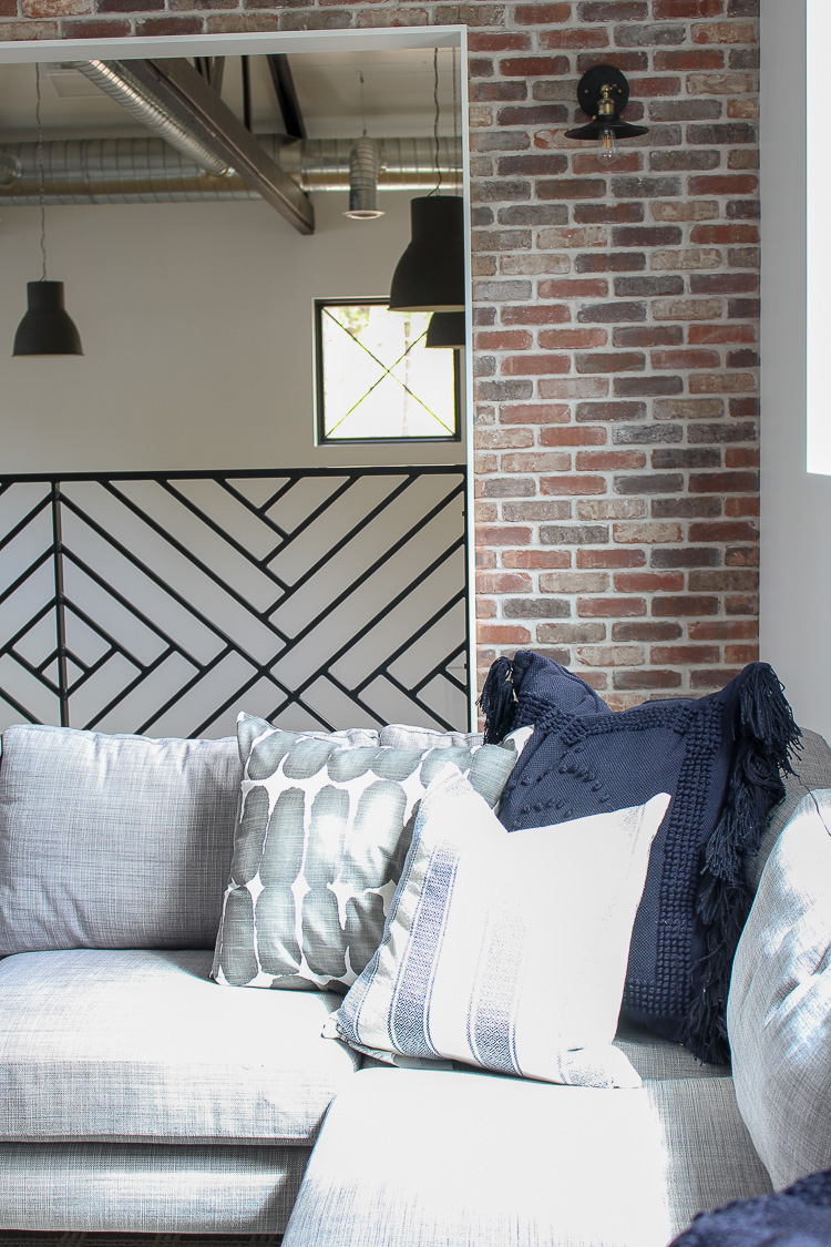
I’m pretty close to being “finished” in here and ready to photograph. We may need a drumroll for this one. 😉
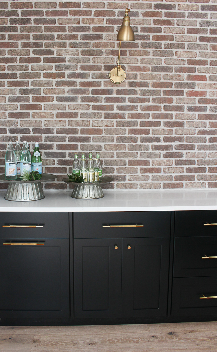
Our bar is another fun spot. Can you tell I have a thing for brick walls? Tim did the labor on all the brick in our home and that makes it even more special. Remember our son’s industrial bedroom HERE with the awesome brick feature wall? That’s the room that ignited my desire to carry the brick throughout the home. It adds so much warmth and texture!
Our family room in the basement hasn’t had any of my attention since the weekend we moved in, but it feels like home with our old sectional sofa and coffee table. See, I didn’t sell everything when we moved! Although the “style” of the sofa is not exactly what I would choose now for this home, the gray color is still really good and it’s super comfy for lounging and watching football on Sundays.
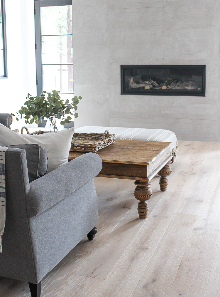
Which leads me to my thoughts on intentional styling. Although the style of The Forest Modern is very different than our previous home, there are still some furniture pieces that fit right in. Our coffee table is old and has water rings on it from years of my coffee mugs sitting on it but it had too many memories attached to it to part with. One of the funnest memories is when I hauled it out to our land before we even broke ground on our home for this beautiful photoshoot HERE.
I’m taking my time as I buy new pieces for this home. I’ve made too many mistakes in the past of hastily buying just to “finish” a room with big regrets and feelings of discontent soon after. Intentional styling is finding pieces that are more timeless and not too trendy. Yes, styles do come and go but finding pieces with good structure and clean lines will definitely carry through the seasons of change. I also am looking at pieces that can be shuffled from room to room when I feel like switching things up.
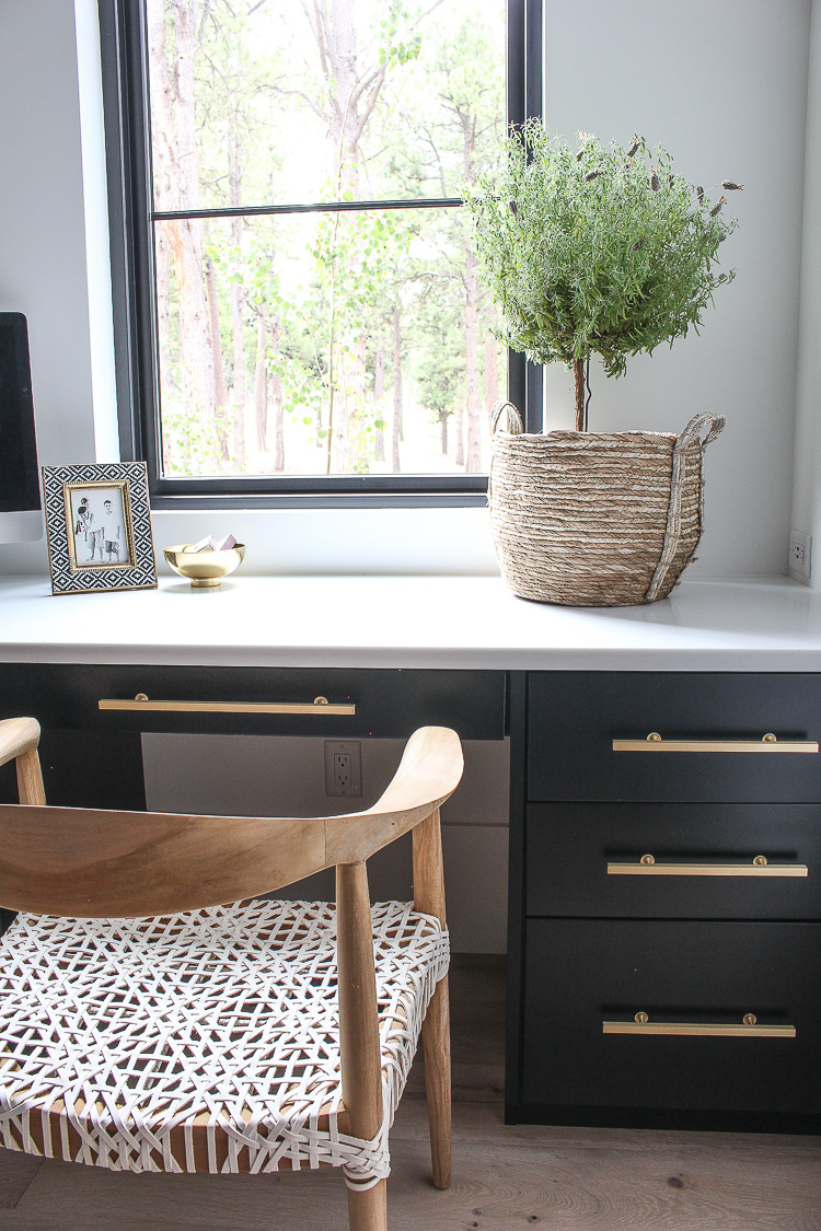
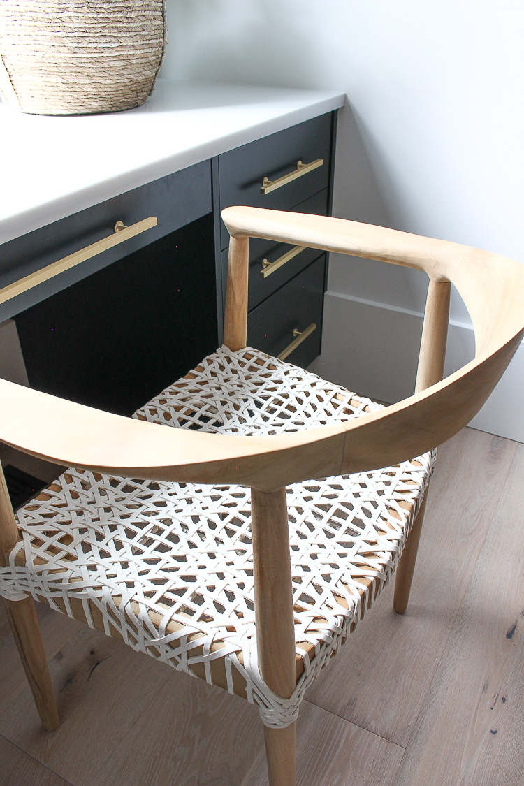
This chair in our pantry is one of those pieces that I want in every room! Let me tell you I pondered buying this chair for months before I pulled the trigger! I’m taking my time and really trying to make sure that I really love the piece before I buy. No matter the price tag, I have found the big splurges or small purchases just need thought out. No more rushing. I’m all about intentional design and finding pieces that will be versatile in many rooms of our home.
My thoughts on the perfect home are that the perfect home does not exist. It’s never perfect. I don’t even want perfect. The imperfect home is the home that will resonate with most people. Whether its a brand new home or 100 year old home, there are always flaws and there is always a journey to decorating. My goal through sharing our home is to give you ideas for your own home. I want to start showing you more of my home in it’s raw form. I’ll give you more snippets of rooms I’m working on and plan to even brainstorm with you on some of my design dilemmas. Quite often, I get stuck on a design dilemma and just need to bounce ideas off of someone.
Our dining room has sat empty for almost 3 months. Except the time when we had a bike in there…lol. The evidence of our reality is right here…
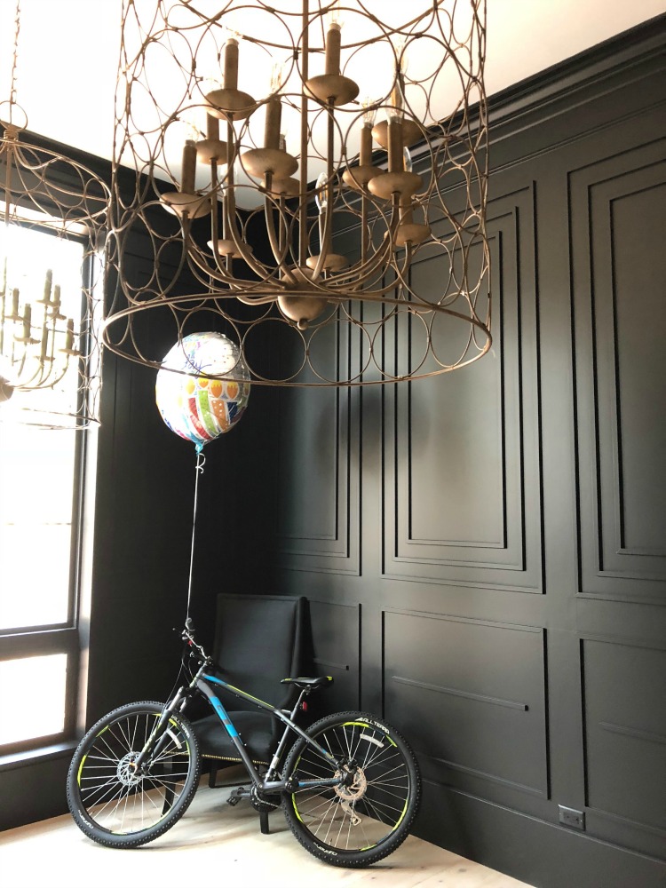
By the way those chandeliers sat in our former garage for 3 years unopened. I had originally bought them to replace lighting in that home but then we decided to move so I saved them. They add the perfect amount of drama this room is about to get!
An exciting delivery happened last week and our new dining room table that weights 8, 578 lbs (give or take a few ounces) was delivered!
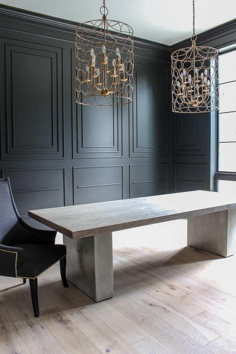
I stewed over this table from Restoration Hardware for 6 months. I knew it was exactly what I wanted but I didn’t want to pay the price tag. I researched endless hours on the internet to find something similar and I actually did. I found THIS TABLE for half the cost and almost purchased it but had a huge fear of the wood clashing with our floors. I had seen our RH table in the store and knew that the wood top would compliment our wood floors and not fight them. So ultimately I decided to splurge, knowing that would then result in other rooms of the house sitting empty for much longer than anticipated. In the long run though, I found a table that I truly LOVE and I took a very long time to make a wise choice. Those other rooms can wait and I’m good with that.
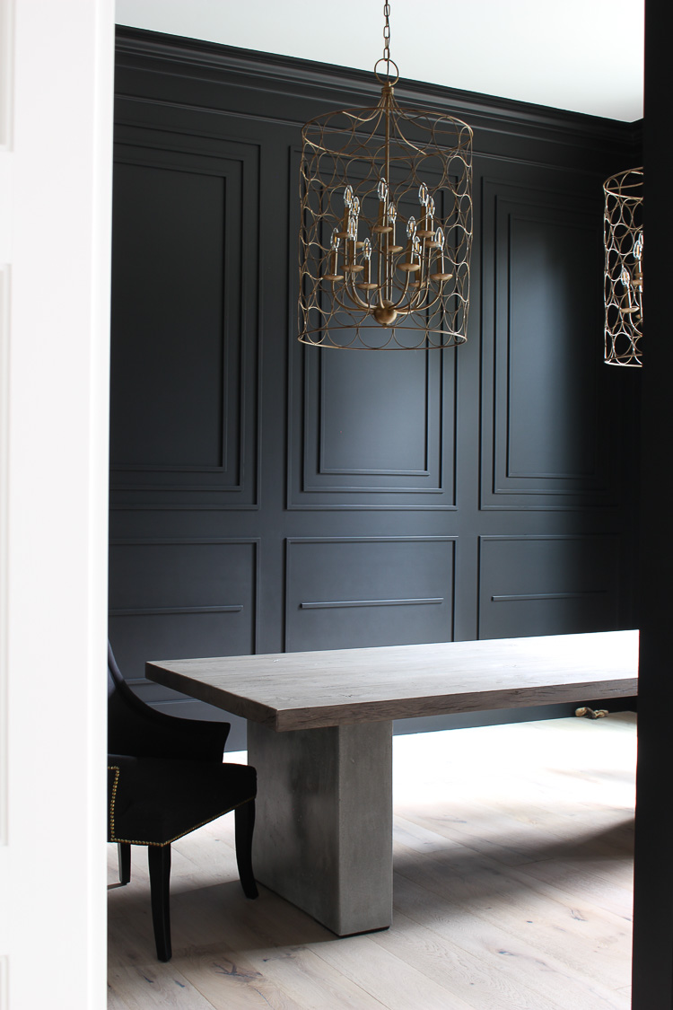
Now if only I could have made a decision on a rug before the table arrived. Not sure how we’re getting a rug under it now! I’ve just about decided to go with THIS RUG. We had it in our last home in the blue color and I absolutely loved it! What do you think?
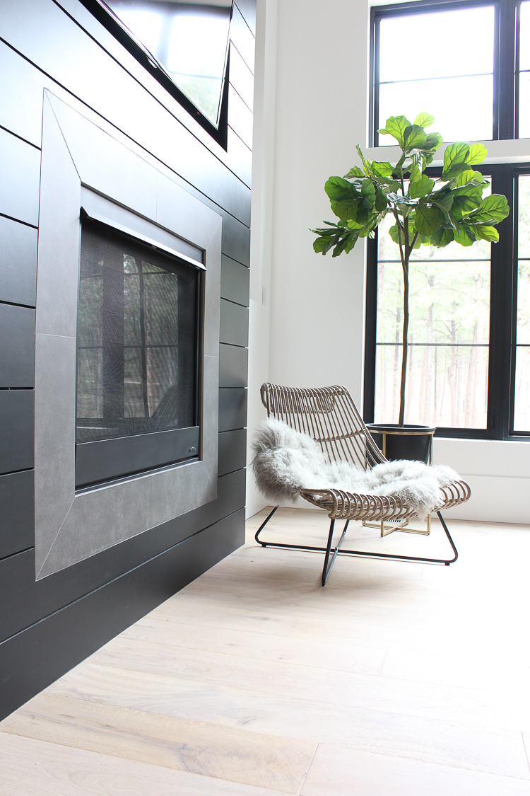
One last room to give you a peek of is our hearth room. This room is halfway close to being done. Rug is on the way. THIS SOFA is in place. I’m still pondering coffee tables. THIS rattan chair is one that I pondered all summer long as well.
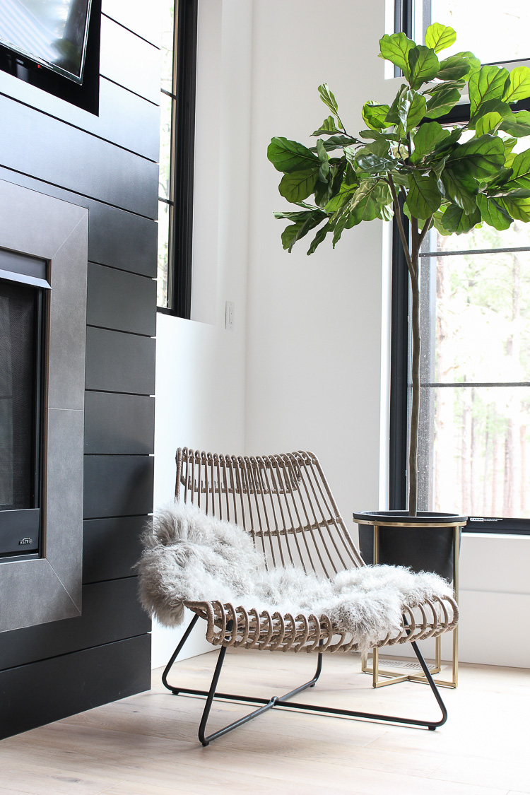
When I first saw it in the store I immediately fell in love but I was worried how comfortable it would be. It’s one of those pieces you can’t stop thinking about. I originally thought I wanted it for our outdoor living space and I’m still liking that idea. I have to tell you though it actually is really comfortable! It has a nice lounge feel, and with THIS sheepskin to soften the hard lines, it’s a good chair to kick back in. Obsessed with the style and the good thing is that I can move it out to the patio if I ever get bored of it in here since it’s made for indoor/outdoor. Win win! By the way, it’s currently 30% off right now in case you’re interested!
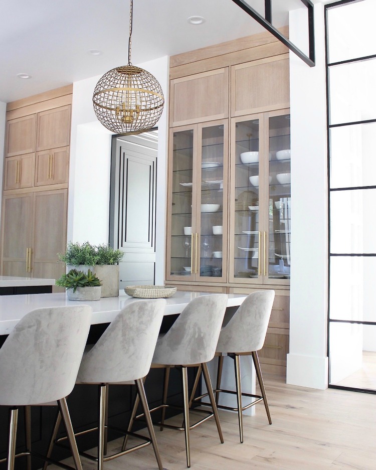
Last, but not least, here’s a little update to our kitchen. When I originally showed the big reveal HERE, I hadn’t purchased these counter stools yet. When they finally arrived, I couldn’t be more happier with them! They are so soft and comfy and the velvet fabric wipes up beautifully between meals. We use this island for our family meals so beauty, comfort and durability (practicality) all had to be checked.
My little tip for you if you don’t have a budget to buy new furnishings or accessories. Go out and buy yourself a yummy scented candle and light it and just see how that makes a difference in your home. It’s truly the little things. Focus on intentional styling and remember that no home is perfect.
Thanks for following along!


I am in love with your home! You are so inspriring. I am doing my kitchen similar. Would you be so kind to tell me the dark color that was used for your cabinets and cabinets in the bar area? Love it!
Hi Tina!Thank you for leaving a sweet comment! My cabinet paint color is “black” by Pratt & Lambert. No fancy name to it! Good luck with your kitchen!
Hey Shauna! So beautiful, love the pieces you pick. Can’t wait to style our new build taking your advice! What is the black paint colour of the bar cabinets? Xo
Hi Mary! Our black cabinets are painted “black” by Pratt & Lambert paints. It’s the brand my cabinet maker uses. Thanks for stopping by the blog!
Love this post! So real, thank you.
I’ll be following along…
Hi Jen! Thank you for taking the time to leave a sweet comment and for following along!
I love following your journey. I would love to know more about the interior doors and hardware. The finishes you’ve chosen for this special home are beautiful.
Hi Karen, thank you for following along! Our interior doors are basic 3 panel shaker sold wood 8′ doors. Our hardware is by Emtek in the satin brass finish. Here’s the link: https://rstyle.me/n/c3hdrhb5e2f
-xx
I love how you mixed modern with rustic/mountain. It all works perfectly together. What color did you use on the white book cases in the first picture?
Hi Ashley, thank you for stopping by! My office built ins are actually a greige, color is Agreeable Gray by Sherwin Williams. I think the sunlight pouring in on them made them look more whitish that day I took this photo. It’s a beautiful color!
-xx
Enjoyed the getting real, way more that just the big reveal (love them too…but prefer this!)
Hi Barb! Thank you for giving me that feedback! I love the “real” so much more too!
Might be a silly question but did you do satin, semi-gloss or gloss on your trim (baseboards, crown, etc)? They look flatter than the norm but I like the modern aesthetic it gives. TIA for your guidance!
Hi! All of my white trim is in semi-gloss, except for the black dining room which is in satin. Hope that helps!
Hello friend! Your home is so lovely. Where did those chandeliers come from? I couldn’t find them in your sources!
KariAnne
Hi KariAnne! Thanks so much for stopping by! Aren’t those chandys gorgeous?!! I believe they are linked within the post but here’s the link directly: https://rstyle.me/n/c7dsd5b5e2f
-xx
Thanks so much for your quick reply! I linked to your amazing post today!
Happy day friend!
karianne
Hi,
Your home is so pretty. I will surely be stealing some of your ideas for my new house. I am trying to finalize on my sectional and my curious to know where yours is from.
Hi Ramya, thank you for the compliment! Our sectional was from a local furniture store in Colorado Springs (Woodley’s Fine Furniture) a few years ago. Sorry I don’t have an online source for you. Good luck with your home!
Hi Shauna,
Your home is beautiful! I am in the process of drafting plans and currently working on the kitchen design. Will you be sharing photos of your full pantry soon? Thank you for sharing this amazing journey.
Monica
Hi Monica, thank you for the sweet compliment! I’m still waiting on some work to be completed in our pantry before I can share more photos of it. Large pantries are so nice if you have the space for it in your design! Good luck!