A Classic White Subway Tile Bathroom Designed By Our Teenage Son!
I suppose I can’t take 100% credit for planning and designing our new home. Our 16 year old son, Ethan, happens to have a good eye and was very opinionated when it came to putting all the design elements together for his bathroom. From day one, he requested a bathroom with classic white subway tile and “dark grout,” specifically not white grout. See, very opinionated! The bathroom that our boys share at our beach cottage is all black and white and apparently he likes that! You can see that bathroom HERE.
He also wanted a natural stained white oak vanity and black fixtures. I like the way he thinks! I sketched up a few vanity design options and he liked the open shelf look at the base of the vanity. Upon his approval, I gave the idea to our cabinet maker and he built exactly what Ethan and I had envisioned. Let’s see the results!
**Affiliate links used in this post for your shopping convenience. See our full disclosure and photo policies HERE.
Classic White Subway Tile Bathroom
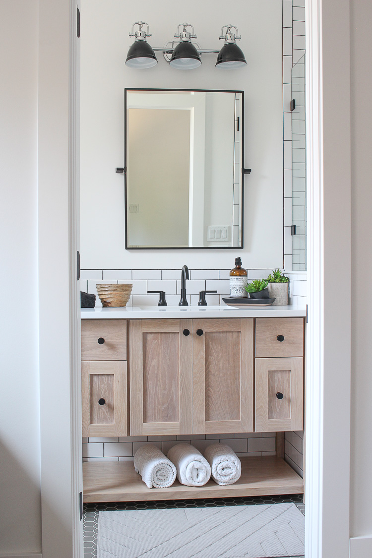
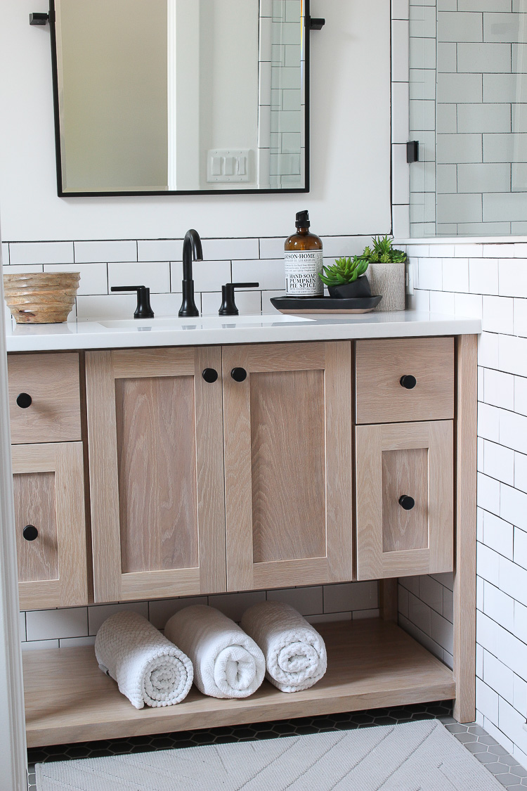
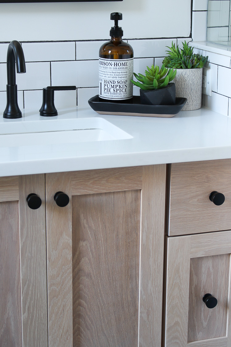
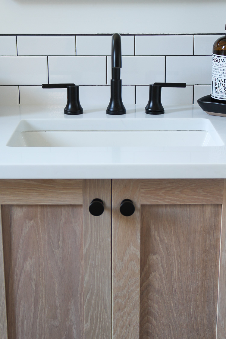
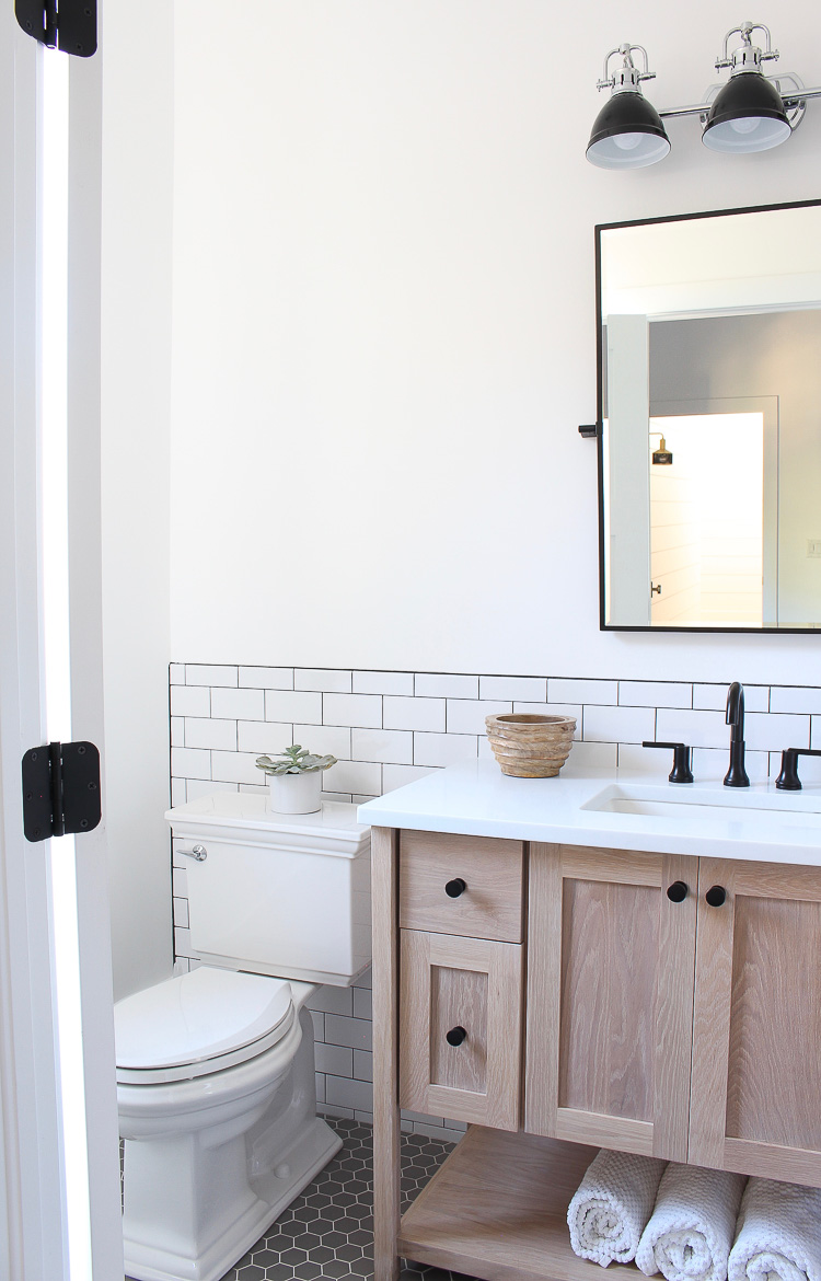
His bathroom is small so instead of having a linen closet, we designed the vanity to have the open shelf for extra towels.
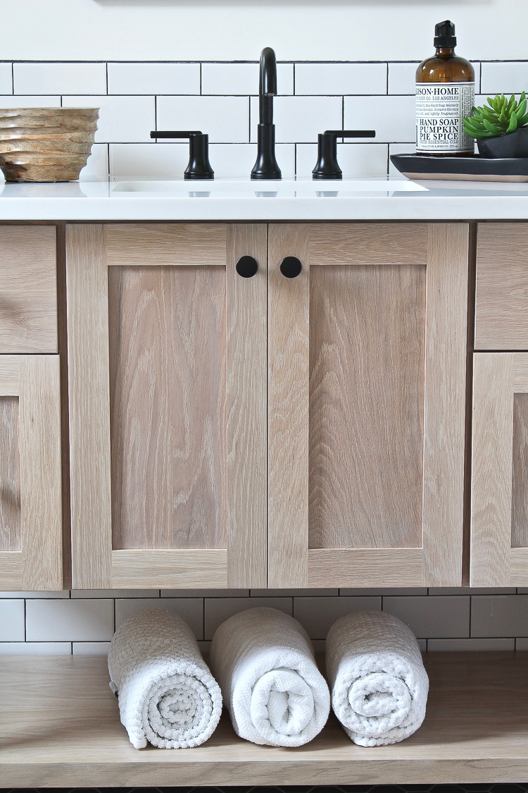
On a side note, I had the electricians put an outlet inside all the vanities to plug in toothbrushes. No more cords and ugly toothbrushes on the countertop! It’s those little things that make a big difference!
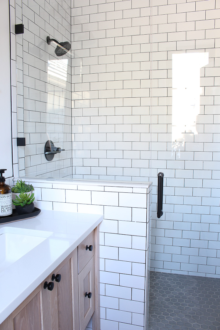
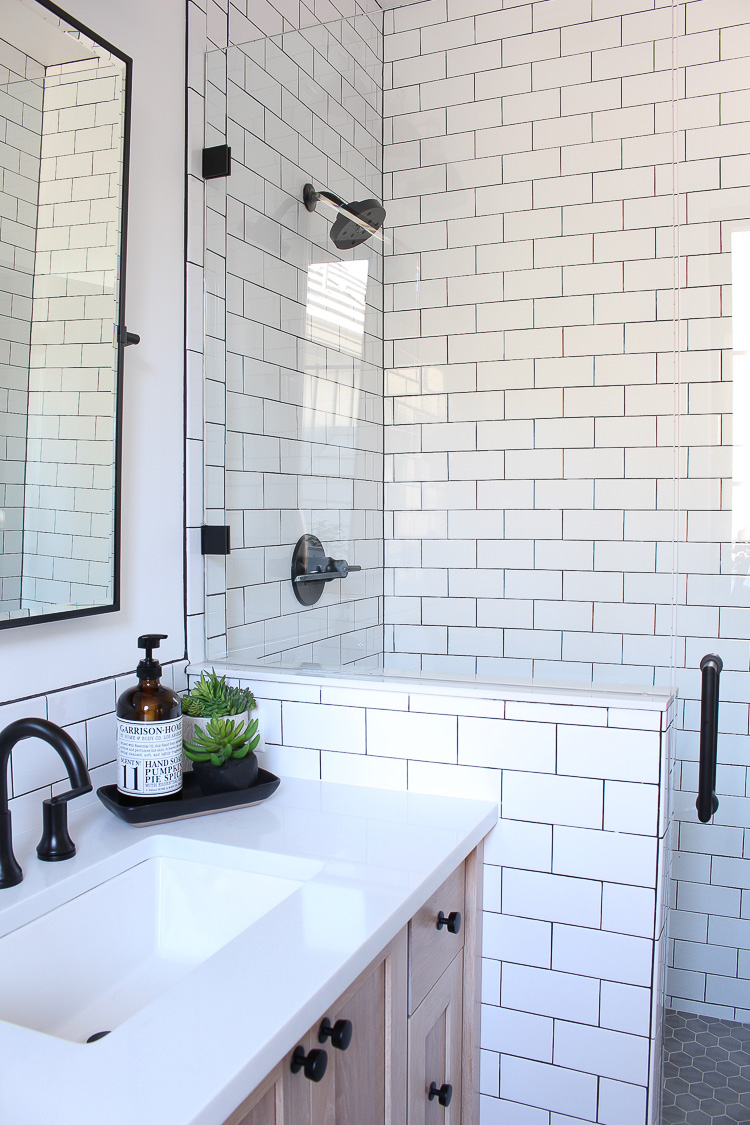
I think he designed a fabulous bathroom! It’s classic with the white subway tile, yet modern with the mix of white oak. I keep telling him he’s hired if he wants to work for me! If you missed it, be sure to check out his industrial modern bedroom and the brick wall he masoned HERE.


This is exactly how i would do my bathroom. Black and white bathrooms are classically timeless.
Thank you!
Love it! Wow..I think he has a future in interior design! What product did you use for the countertop? Also, what tile did you use for the floor..love grey vs..black!
Thank you! Countertop is quartz by Aureastone, color is Phidius.
Floors are taupe grey hex from Floor and Decor.
Great job, Ethan… It’s perfect! And I’m with you on the electric toothbrush situation. What a great idea to hide it below. Loving your entire home so much! xoxo
Thank you Kristin! You’re so sweet. Best decision ever with the toothbrush outlet under the vanity!
I think maybe we have an architect or designer in the works. It is gorgeous.
Thank you Marty! I think so too! 😉