Our Finished Little Powder Bath With Delta
Thank you to Delta® for sponsoring today’s post. All designs, opinions and photography are my own.
I’m excited to share with you today our recently finished little powder bath! Just a few weeks ago I showed you the one bathroom in our home that we ended up not completely finishing during the building process. This powder bath is in our basement which means it got pushed to the bottom of the #prioritylist. Let’s look at what it looked like before.
**Affiliate links used in this post for your shopping convenience. See our full disclosure policy HERE.
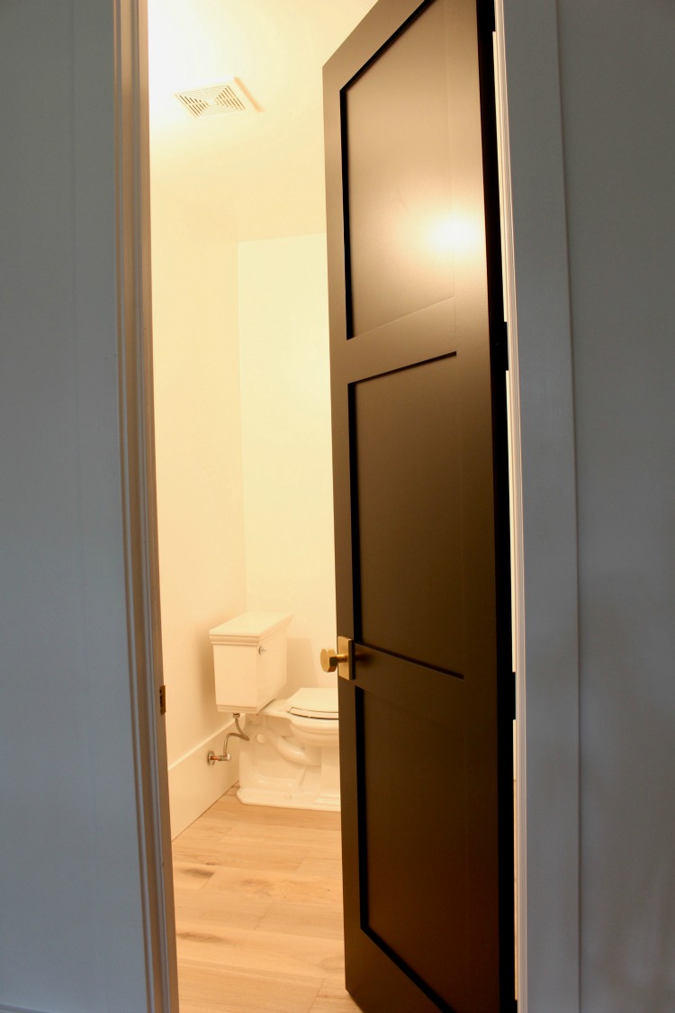
All we had in there was a toilet. With no sink installed, obviously no one was using this bathroom.
One thing I’m really learning to appreciate in designing a room, no matter the size, is that it’s okay to let it evolve over time. Going into this project, I had planned to plank the walls with shiplap. Doesn’t sound too modern like the rest of our home, right? But, when you paint the shiplap black it suddenly takes on a modern edge. We have black shiplap walls in our mudroom which I’ll be sharing more later and they definitely have a modern vibe going on.
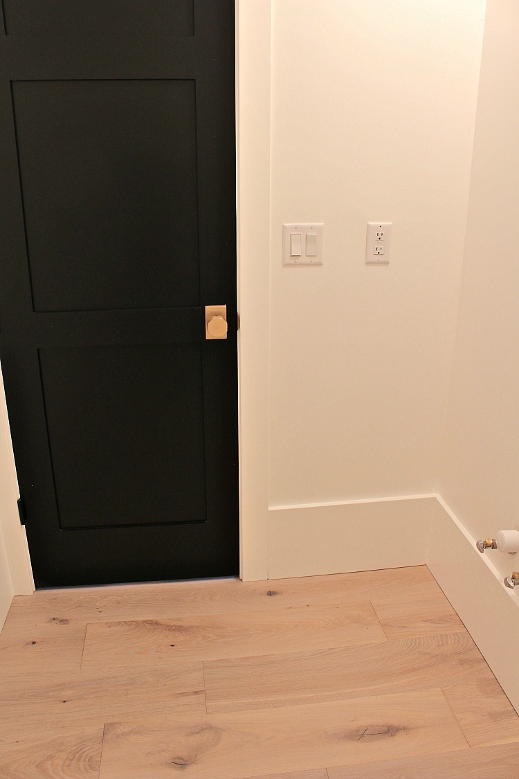
What I realized though in this small bathroom is that the black shiplap would make it feel too dark. Note that there are no windows in here. Now my mind has shifted from black walls to doing a grasscloth wallpaper or perhaps doing nothing at all leaving the walls white. The wall color is Sherwin Williams Pure White (as is our entire home). Down the road I may end up doing some sort of wall treatment, but for now, I’m really happy with the current new look.
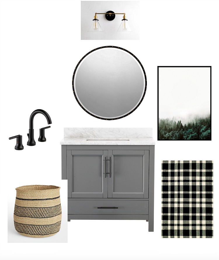
This was my original design plan for the bathroom. I envisioned a modern, organic feel that would reflect the design going on in the entire house.
Let’s take a look at how it turned out!
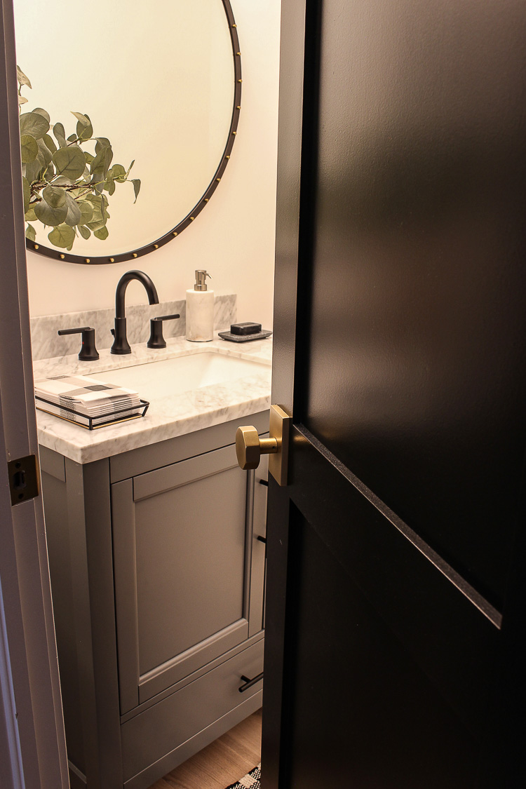
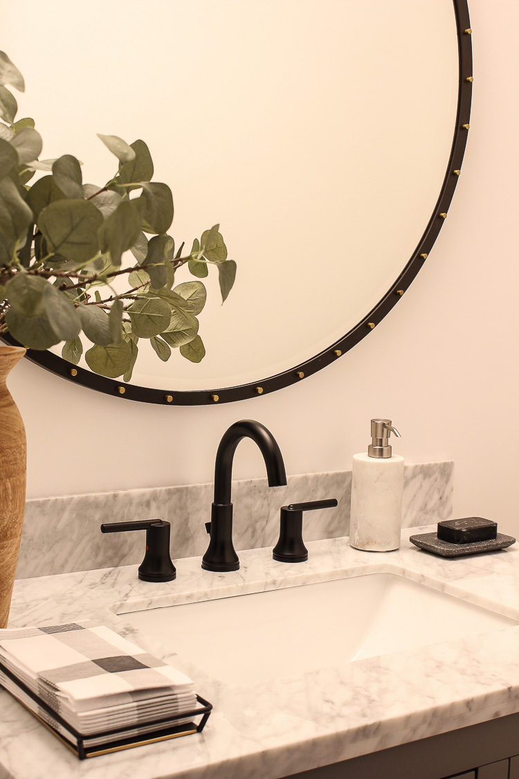
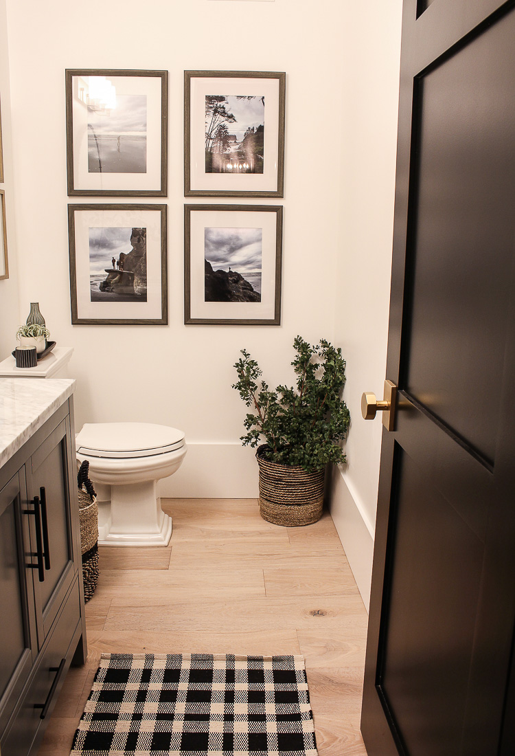
When we built our home, I worked with a cabinet maker to custom build all of our bathroom vanities. For this bathroom, however, I wanted to go the more affordable and convenient route of buying a vanity online with a marble top. This gray vanity exceeded my expectations and I especially love that the black hardware that came with it matches my matte black Delta® Faucet.
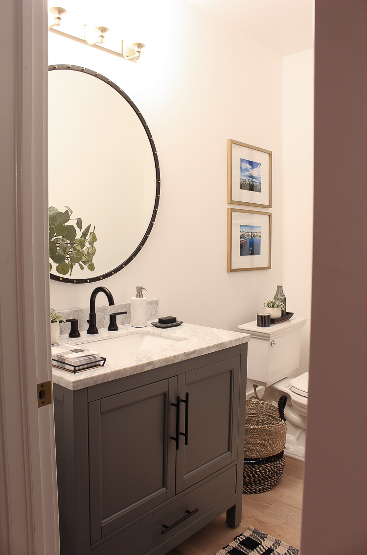
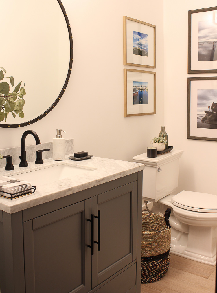
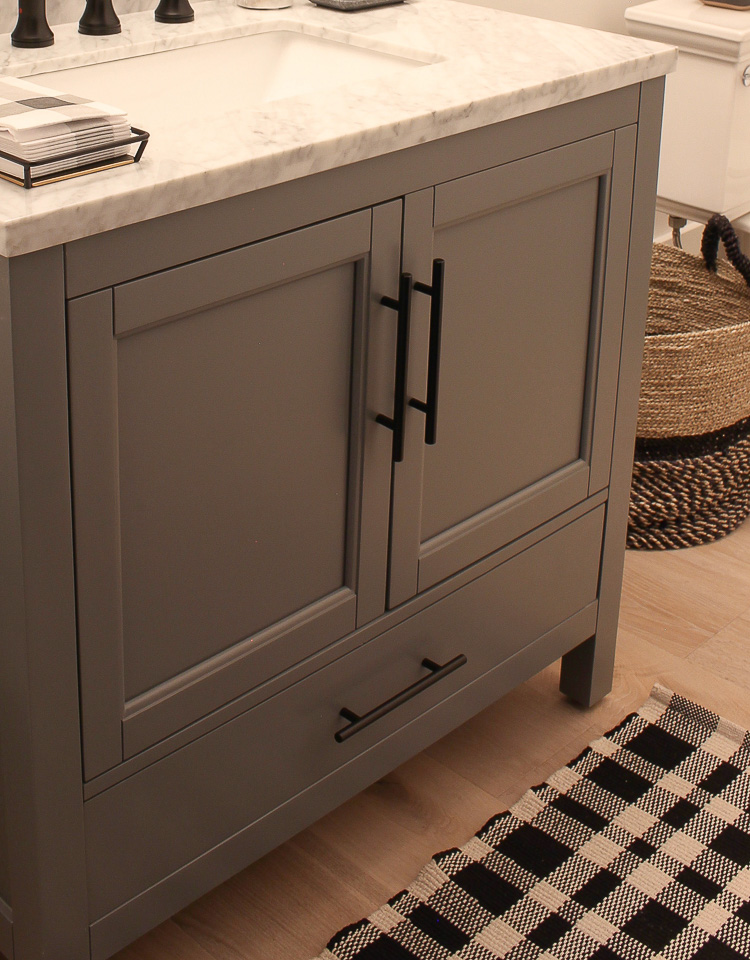
Speaking of faucets, I always think of my bathroom hardware first and then pull in the design elements around it. It’s the jewelry of the bathroom and should make just as much of a statement as everything else you thoughtfully design.
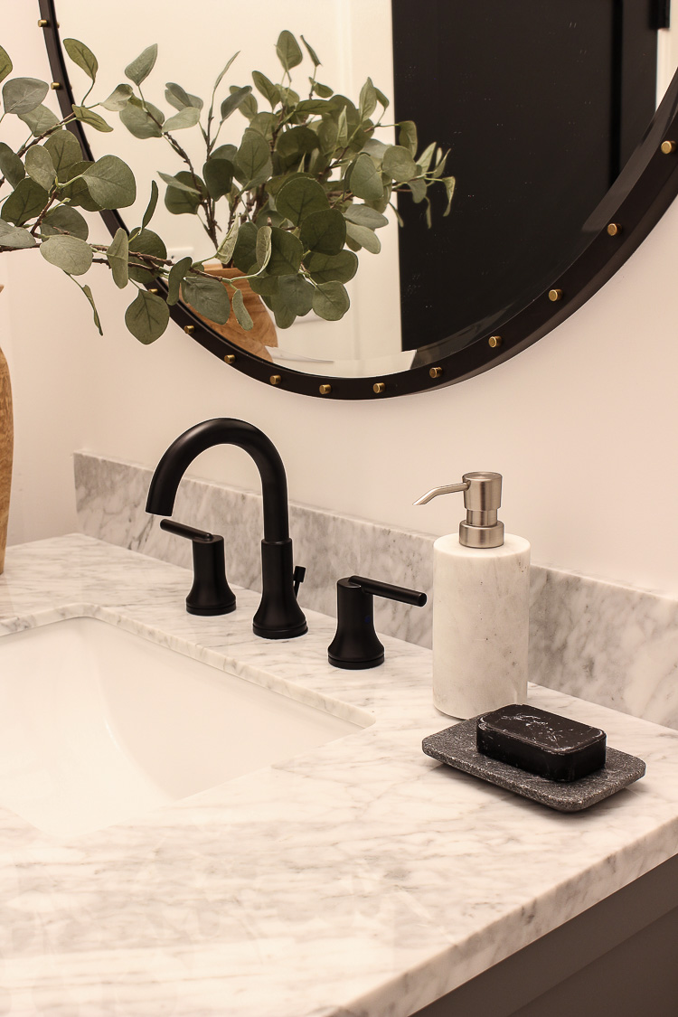
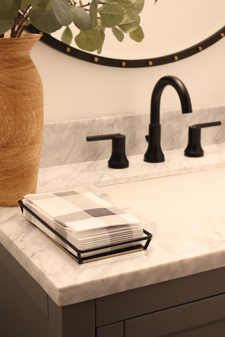
I’m such a fan of this Delta® Trinsic™ two handle widespread bathroom faucet. It has such a sleek and refined look and is one that I think would be a good choice for any bathroom design, whether it be modern, farm style or simply traditional. It also comes in five different finishes. Matte black is a big design trend currently and one I believe is going to stick around for quite some time. I’ve actually put this faucet in all of our boys’ bathrooms and just can’t get enough of it! You can see it in one of those bathrooms HERE.
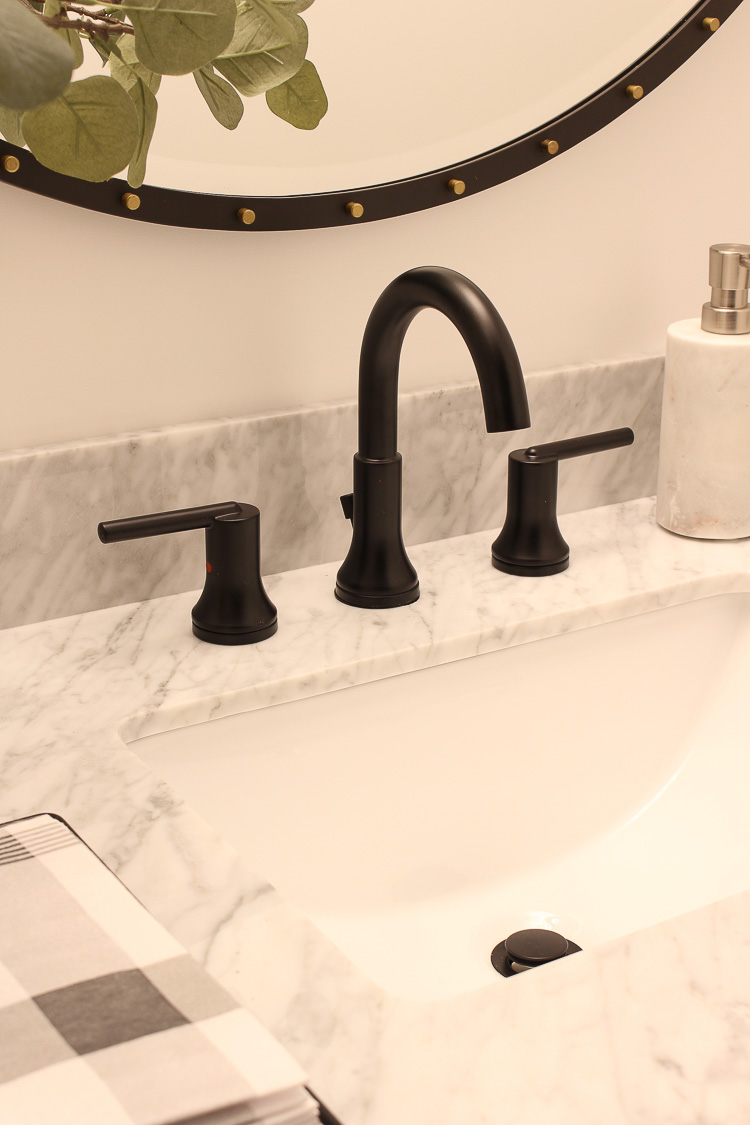
Along with beauty of the faucet, I also look for strong qualities in function with the ability to stand the test of time. I like that this Delta Trinsic faucet is WaterSense® labeled which means it uses at least 20% less water than the industry standard. For those of you who have been following us long enough to remember our beach cottage renovation a few years ago, we put Delta faucets in that entire project as well. They’ve stood the test of time beautifully! You can see more of our beach cottage and those bathroom renovations HERE.
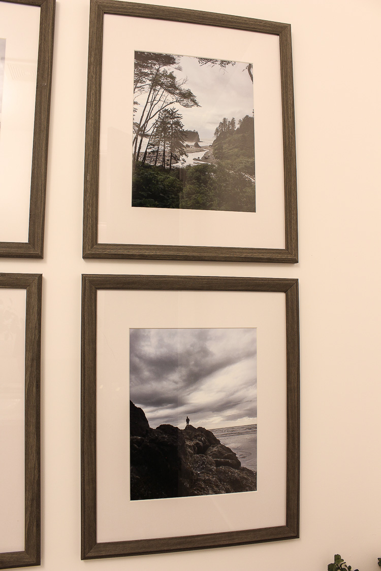
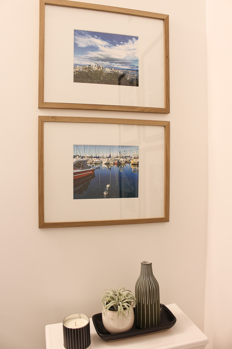
A few other thoughtful design elements I chose for this powder bath are the photography prints on the wall. I took some candid photos from my iPhone of our trip to the pacific northwest – Seattle area last year and framed them. I love having memories of places we traveled on our walls. Sometimes, that’s the best “art”.
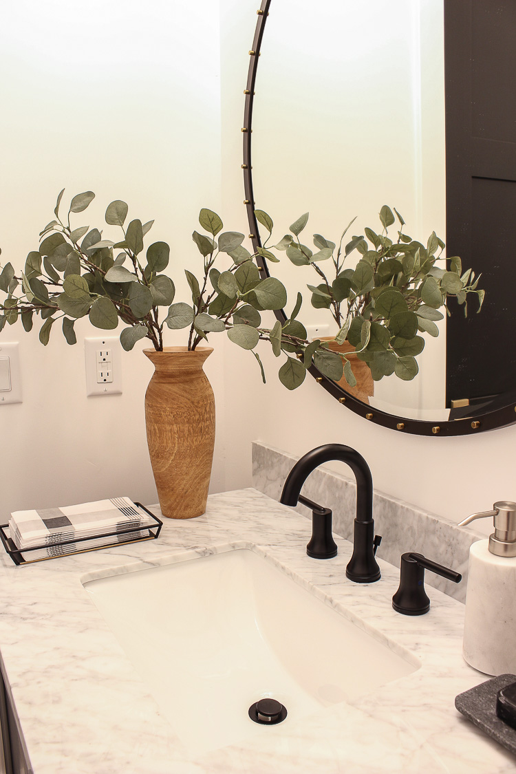
I pulled in an organic feel with a simple wood vase and eucalyptus stems. The black metal mirror ties in with all the black steel we have in our home. Those brass studs give it that edge!
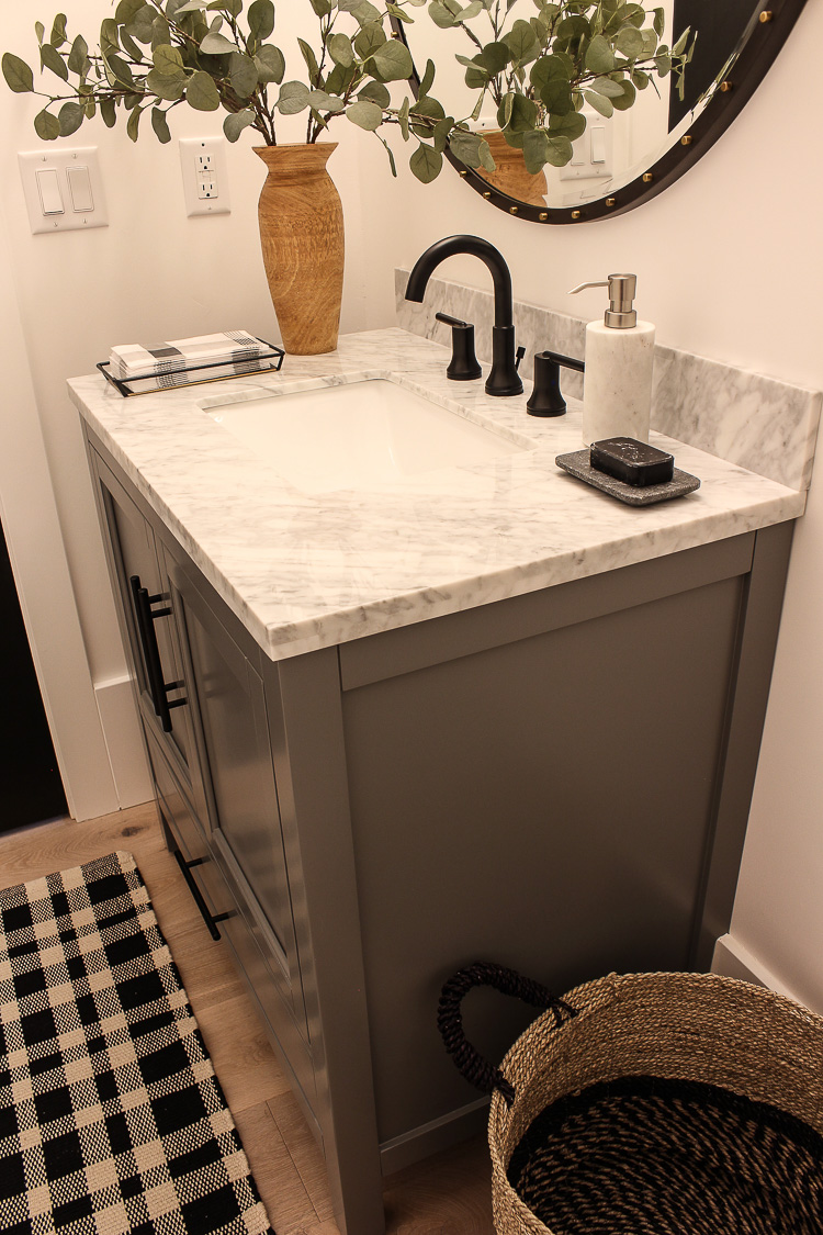
The rug may look familiar. It’s the same rug that has become wildly popular in our hearth room. Instead of hanging a traditional hand towel holder on the wall, this little hand towel tray looks pretty and minimizes the spread of germs that hand towels can hold. I’m a germaphobe, what can I say.
I hope this bathroom design inspires you if you’re planning a renovation or remodel in your home. I’m happy that Delta® Faucet has chosen me to represent their brand since it’s one I’ve used for years and truly love all the products they offer!
Sources (scroll & tap to shop)
This is a sponsored conversation written by me on behalf of Delta® Faucet. The opinions and text are all mine.


It’s gorgeous. Love the vanity and the floors are the perfect color. Great art also. You did an amazing job.
Thank you Marty! You are always so sweet with your comments, I appreciate it!!
xo
I love all the different elements! I especially like that you used photography from Seattle ! It’s my hometown and so beautiful! Will you put anything in the basket between sink and toilet or is it just decor?
We LOVED Seattle Sascha! Can’t believe how gorgeous that whole surrounding area is! Currently, that basket is holding toilet paper (LOL!!) even though my vanity could hide it away. I actually like empty baskets for decor and don’t feel like they always need to be filled with something. For those who may only have a pedestal sink in their bathroom however, a basket is great for holding towels or TP 😉
I love that you took your time to finish this bathroom. I’m in the midst of a larger scale renovation and I keep telling myself that it’s ok to take my time with things. I remember your post a while back when you talked about building the house and how you would have the builder tear down stuff that didn’t look right so you could tweak it and it’s brought me such peace of mind to know that. Rome wasn’t built in a day! Thank you for these insights and for sharing with us your beautiful home! 🙂
Thank you so much for sharing your thoughts with me. You are so wise to take your time with your renovation. In the long run you will save money and ultimately be much happier with the final outcome when you allow yourself time to think things through. There are still a lot of aspects of our home I wish I would have thought out more, but reality is that it’s never exactly as envisioned. Just enjoy the journey and learn as you go! Best of luck with your project!
Beautiful job! I love how the warm wood floors and frames keep the black from being too harsh. It’s a very small room with no window and the black would have made it feel cave like. I like the pure white with black accents. Modern and clean but not cold. Perfect!
Thank you Joanna! You’re so right! It would have looked and felt like a black cave…sigh. Good thing I’m loving white walls!
Simply beautiful! I’m glad you left the walls white they look amazing. We recently remodeled our powder room and painted the walls black, looks amazing too!
Thank you Denise! I bet your black powder room looks fabulous!! Glad you like my simple white. Let’s the art stand out!
xo
What a great space and I love the personal touches!
Thank you Holliday!!
xo
All so very beautiful! How smart of Delta to choose you as their rep! Your new home really makes their faucets shine!
So proud of you!
Thank you so much!!
xoxo
Can you please link the light fixture above? The clear glass with brass and black – I think it was from Etsy?
Hi Kristen, that light fixture can be found in this post:
https://thehouseofsilverlining.com/the-forest-modern-design-plans-for-a-modern-organic-bathroom/
We ended up going with a different light fixture but I still love that one!