Our Sleek Minimalist Living Room
When I designed the living room space of our new home, I envisioned it being sleek and minimal. A color neutral room grounded by a statement fireplace as the focal point with refined furnishings. I’ve craved simplistic style in this home that does not require a lot of adornment. I think the massive purge of home decor I did before we moved really has helped me stay very intentional on the new pieces I buy for this home. It took me a couple of months staring at an empty living room to get a feeling of how I wanted this space to look and feel.
**affiliate links used. Our full disclosure can be read HERE.
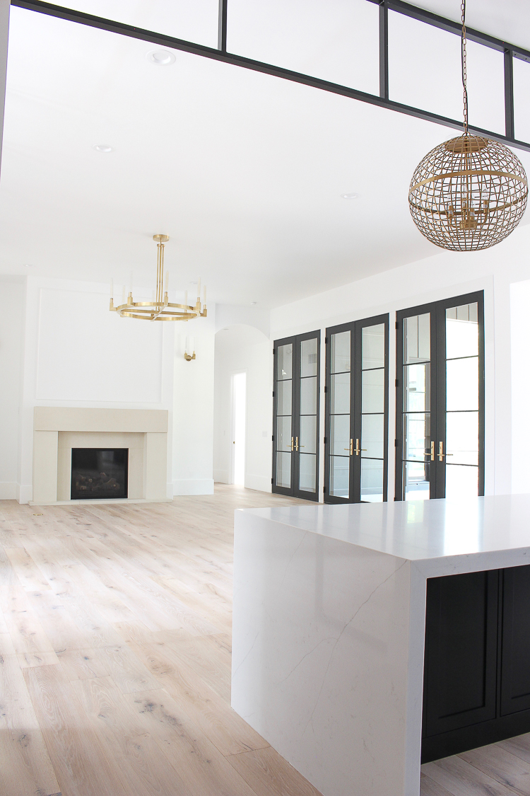
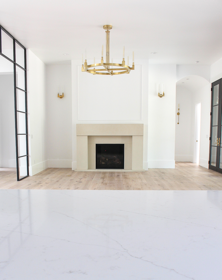
For me, an empty room felt better than a room filled with furniture that no longer represented my new evolved style. I took my time researching sofas, coffee tables and rugs. I found myself a few times straying from the neutral-refined look I was craving and looking at beautiful saturated colors. Although that design recipe can make for a fabulous living room, I had to remind myself to stay true to the “feeling” I had felt all along. Let the gorgeous fireplace mantel make a statement on it’s own. Surround it with neutral tone furniture that feels organic, refined, and simplistic, yet bold in stature. Layer the space with multiple textures in the natural woven jute rug, assortment of pillows, and accessories.
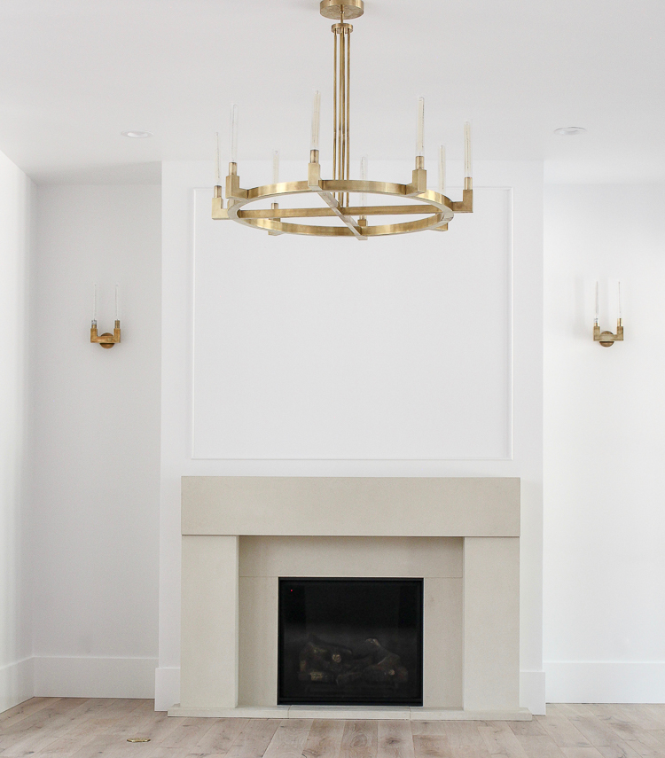
The chandelier and sconces are the jewelry that truly take our living room to the next level. I’ll have all sources listed at the end of this post.
After living in our home for 5 months now, I’m finally at a point where I can show you the updates to our new sleek, minimalist living room. There’s still final touches to be done, including adding a mural or wall art above the fireplace mantel and maybe a lamp or two on some end tables. Right now though it feels exactly how I wanted it to feel and just in time to decorate it for Christmas!
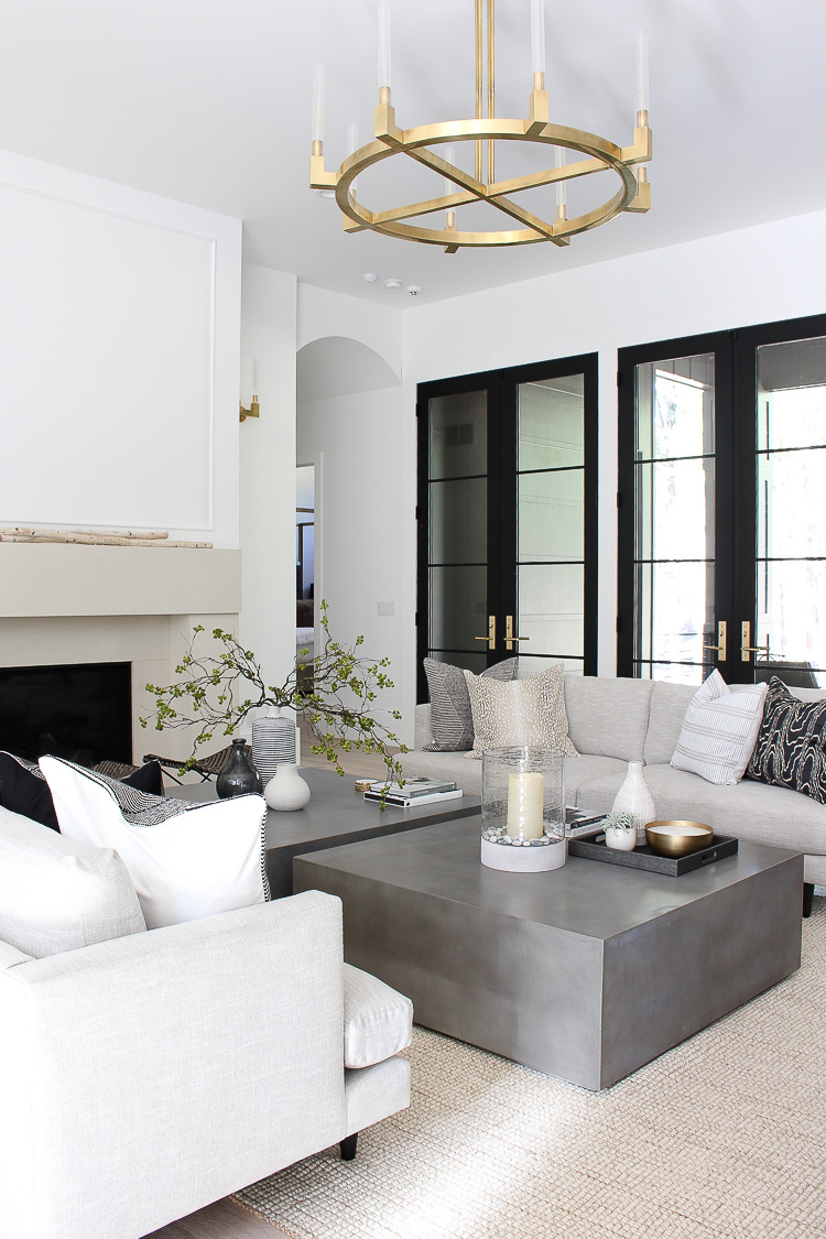
The concrete-look coffee tables have a nice contemporary, organic look that make a bold, yet refined statement. We have 12 foot ceilings on the entire main level of the home which can make furnishings feel like dollhouse furniture if not thought out carefully. Two large square coffee tables positioned between the two matching sofas really ground the space, giving a nice flow of symmetry.
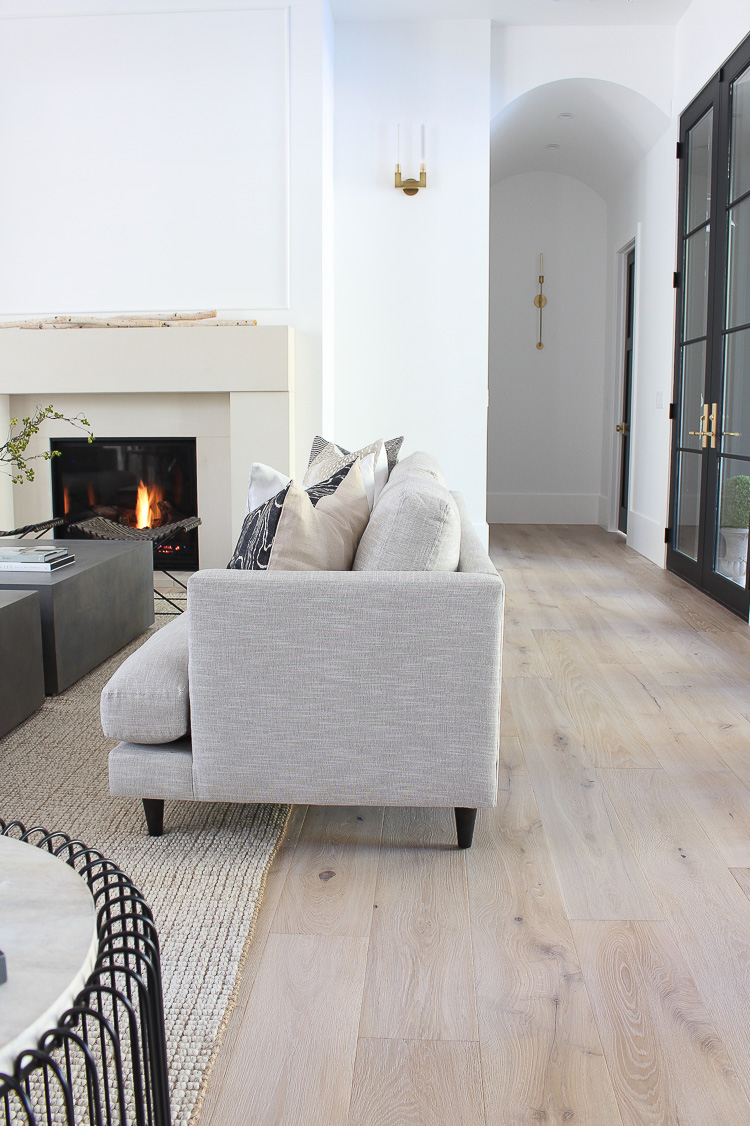
Speaking of sofas, I cannot be happier with the ones I chose after doing all my research. A furniture store I’ve always loved yet never actually owned furniture from is Room & Board. I’ve had friends who have owned furniture from this store and I was impressed with the quality and the modern, Scandinavian style. I visited the Room & Board store in Denver to try out some sofas I had my eye on. Not only was the overall look of the sofa of utmost importance, but the comfort level and durability were also big factors in making my decision. I looked at quite a few fabulous sofas there, but the one that ultimately had my heart was the campbell sofa.
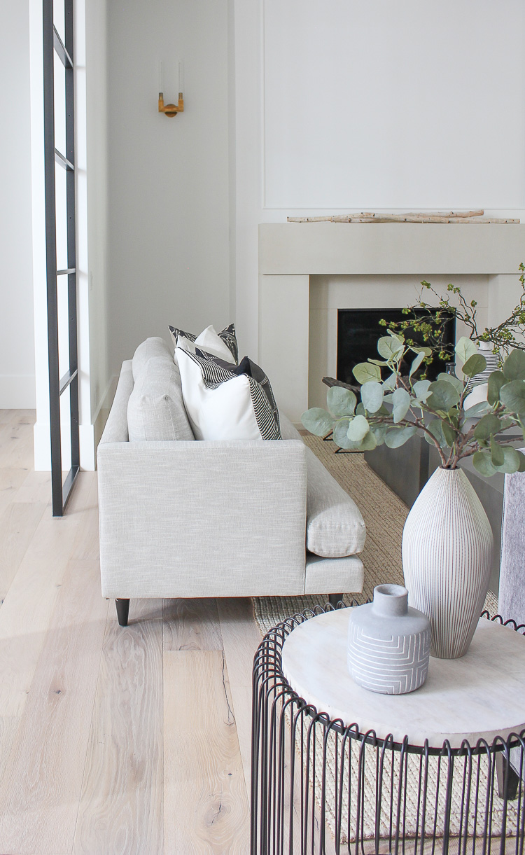
The modern profile is exactly what I was looking for with its timeless look. The cushions are very comfortable and are made out of an eco friendly, high resiliency, foam core wrapped in a down feather blend. They are made to hold their shape over time without compromising comfort. I went with the in stock fabric, Destin Linen, which is made out of synthetic fibers making it family friendly, fade resistant and a low maintenance fabric to care for. Obviously that’s a big selling factor for me since my dogs are always sneaking their way up onto the furniture and we have a house full of boys. Another great feature of this sofa is that it is available in three lengths. Ours is 96″ and has seated four adults comfortably with elbow room left over. It also can be customized in a variety of other beautiful fabrics.
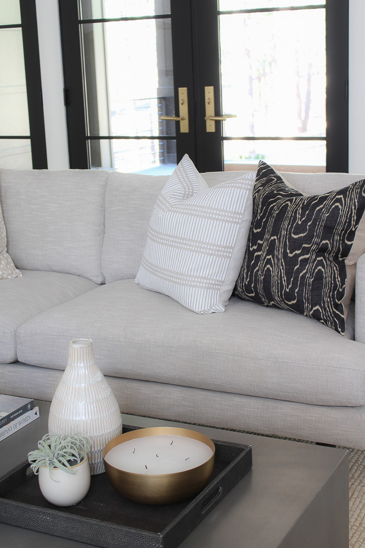
The great part about having a neutral color sofa with clean lines is that I can switch out my throw pillows with any color or texture and it’ll look great! The linen fabric is the perfect backdrop to any color trend I may want to incorporate down the road. Mixing pillows and textures is a great way to add a lived in organic feel to your sofas. I focus on blending different patterns within the same neutral color scheme to give a cohesive feel.
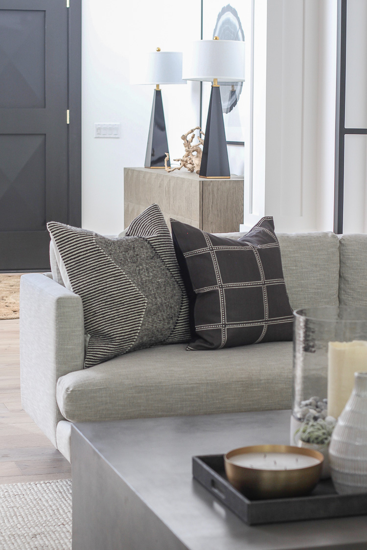
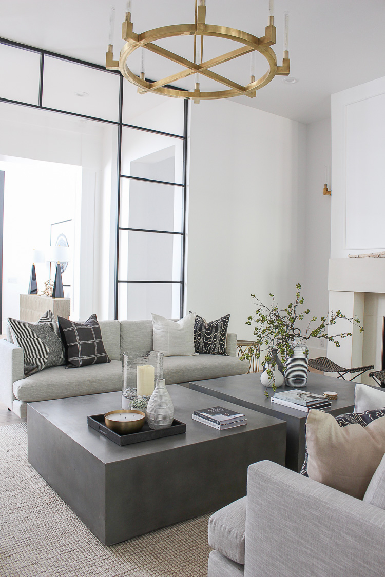
The rug may have been my greatest challenge making a decision on. I would look at rugs with a hint of color and pattern and they wouldn’t feel right to me. The concrete coffee tables needed to stand out against a neutral rug with great texture. I didn’t want to add any more focal points to the room, yet a rug was necessary to define the space and ground all the pieces of furniture. This natural jute rug I chose is another GOOD decision and one that I recommend to everyone now.
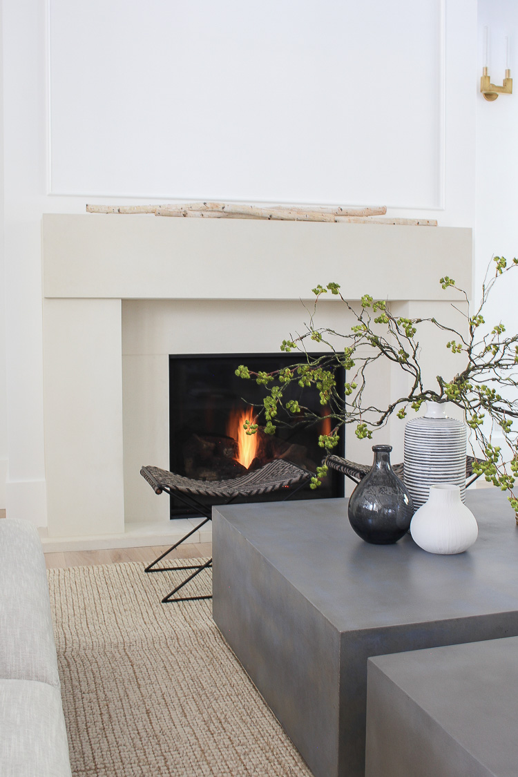
A pair of stools (also from Room & Board) are nestled next to the fireplace to allow extra seating without taking up visual space. The steel frame with a handwoven Kilim pattern sling seat is perfect for sitting on to warm your toes and fingers during our long cold winters.
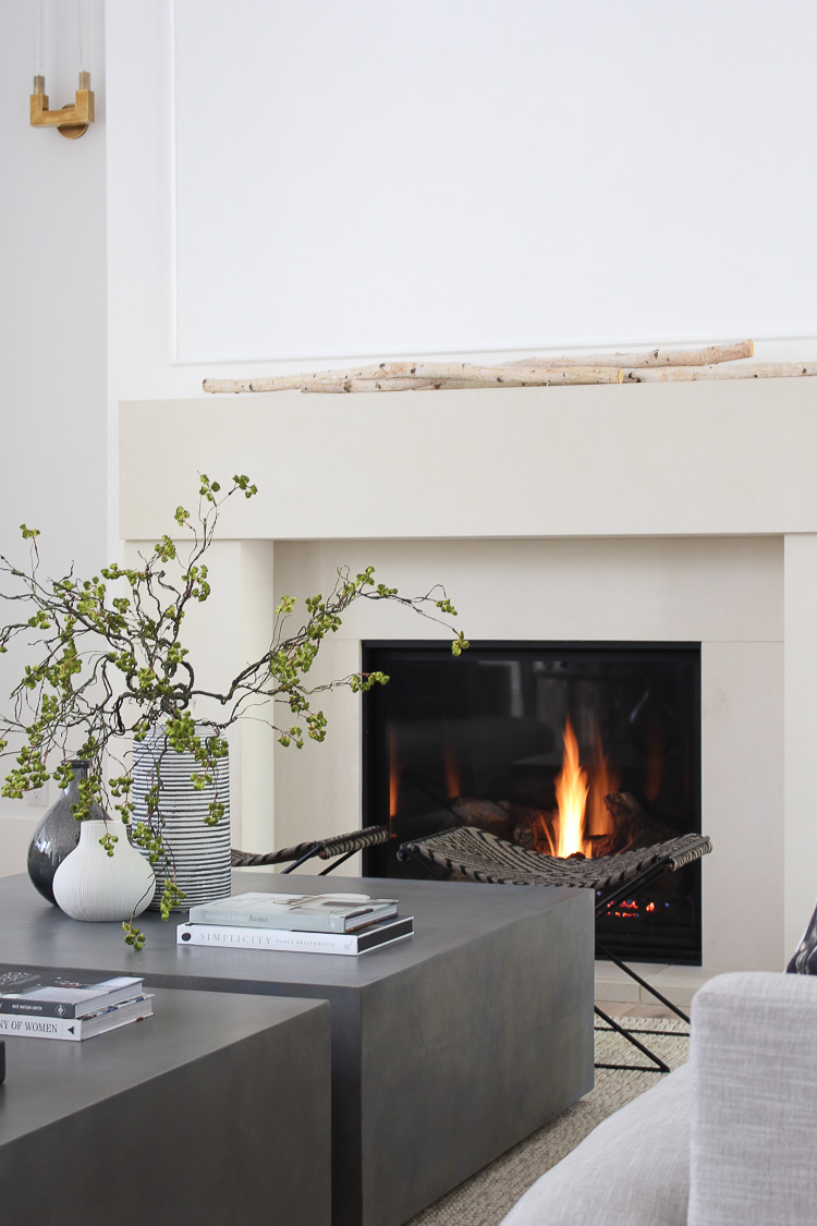
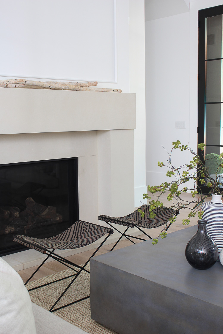
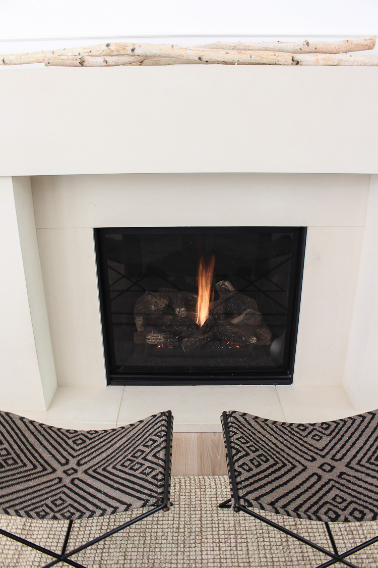
As I mentioned previously, I haven’t quite found what I’m looking for to finish of the wall space above the mantel. Honestly, the bare wall doesn’t even bother me and I’m embracing the simplistic backdrop that I’ll get to decorate for Christmas. A few birch tree branches give a nice organic feel and that’s simply all it needs for now.
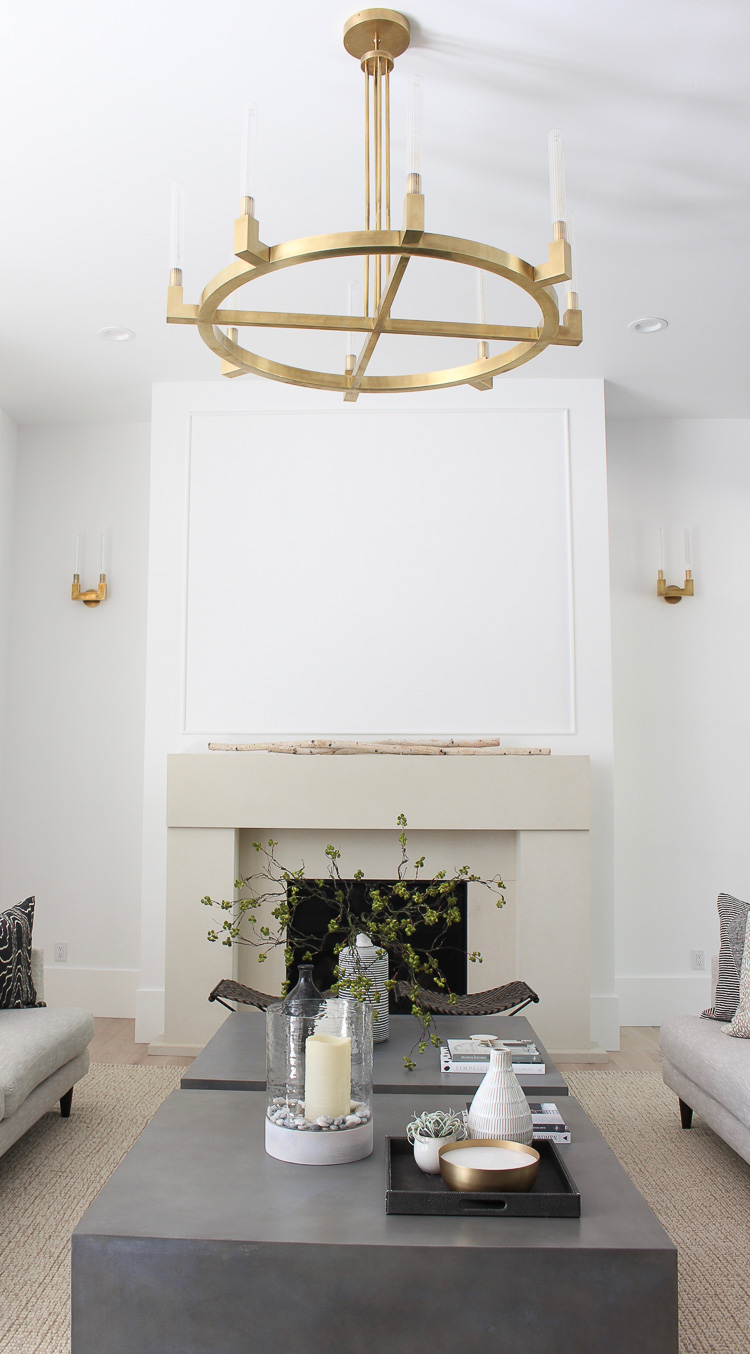
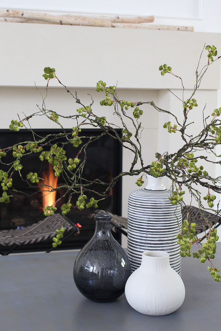
More layers of organic textures were added with some faux branches among a trio of vases.
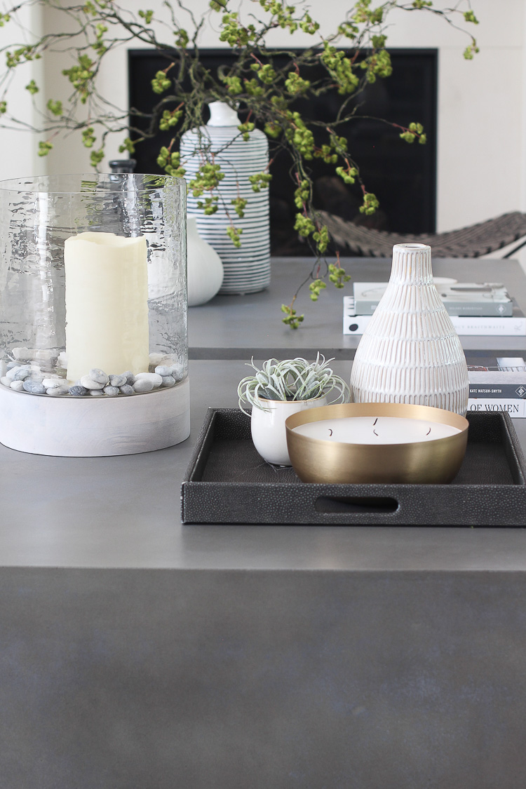
Having a large coffee table can have the tendency of making the accessories feel a bit lost. I like to use trays to group items together and give them their own defined space.
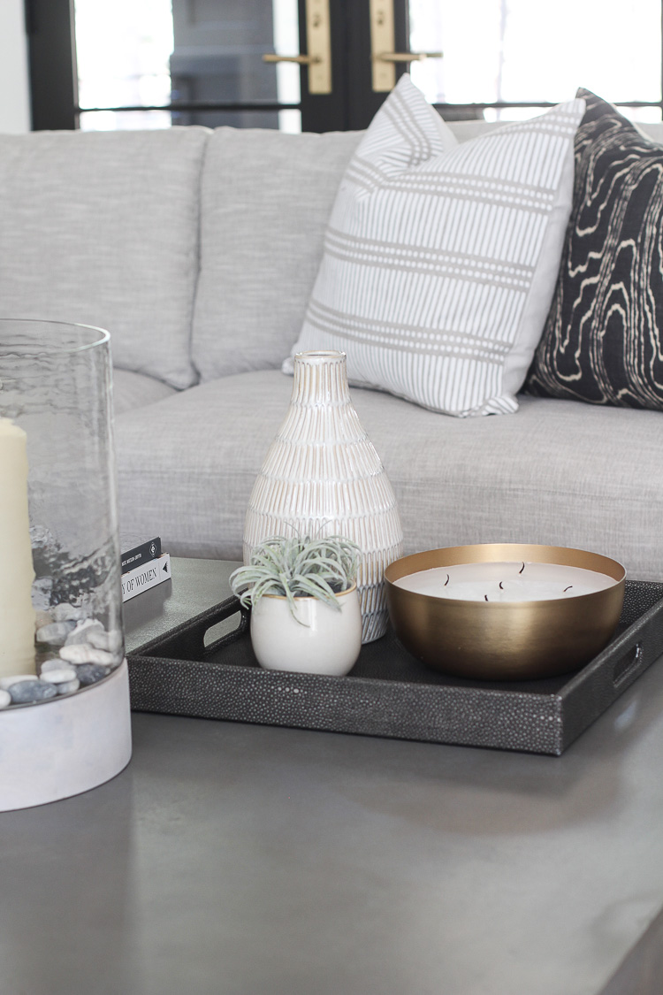
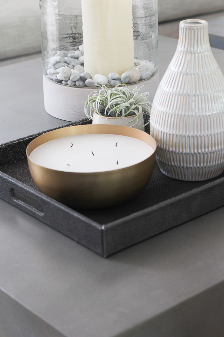
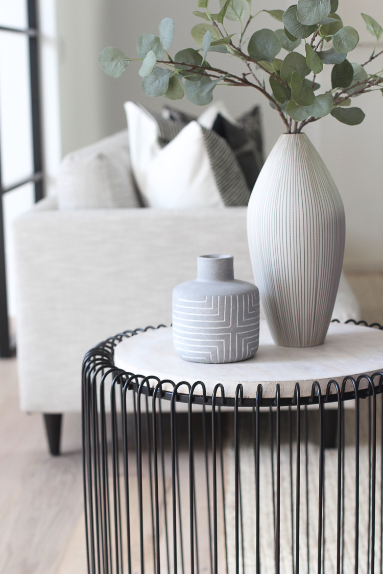
You can see a glimpse of our front entry. I’ll be posting more on that space soon with a full source list.


Additional Sources:
Furniture: Sofas (color is Destined Linen) | End Tables – Homegoods find!
Lighting: Chandelier | Sconces
Wood Floors: Info can be found HERE.
Paint: Walls are painted in Sherwin Williams Pure White
French Door Hardware: Emtek
Special thanks to Room & Board for providing some furnishings in our living room. All opinions and photography are my own.


Stunning! Everything is just so well put together. The wall color, I love how it compliments every room. Is that BM line and if so, would you mind sharing the color?
Thank you Natalie! Walls are Sherwin Williams Pure White 🙂
What is the color you went for your doors?
Thank you!
Hi Brianna! Our doors are Tricorn Black by Sherwin Williams
It is gorgeous. Love your furniture choices, everything looks amazing.
Thank you Marty! It feels good to have furniture to sit on! 😉
It all looks so gorgeous! Simplicity is so lovely…thank you for sharing so freely. Enjoy the holidays and your family in your beautiful well thought out home????????
Thank you Linda for such a sweet comment!
Such a beautiful space! I love it! I’m always coming to your home for inspiration for my own. We are in the construction process now. I love the choices you’ve made! I was curious as to what chairs you have in this space? I thought I may have seen a slither of one in your pics? Also, do the sofas have a texture to them? I need to be careful with things that have texture due to my cats. ???? They like to pick at the things with texture. Thanks and have a great day!!
Hi Catherine! I hope your construction process is going smoothly! It can get a little stressful at times, so hang in there! We have our grey velvet daybed in the living room as well. You may remember it from our previous home if you’ve followed us for a while. I’ll share more photos on Instagram soon with the daybed in view. Also, our sofas have no texture, just smooth linen feel. Hope that helps!
xo
I absolutely love everything about your house and your design. I’ve followed your entire build process as we are custom building ourselves. If we had the budget we would seriously incorporate so much of the beauty that you’ve put into the design of this house. It’s like you took my dream design vision and brought it to life. Every room you reveal just builds upon this stunning home. Congratulations to you and your family! I’m taking as much inspiration as I can from the Forest Modern for our new home.
Hi Carmen! I so appreciate you taking the time to leave me such a sweet comment! My goal has always been to inspire others in a positive way and I’m glad that our home has given you inspiration in your home! Best of luck in your building journey.
xo
I love everything about your house!! Can you tell me what size you ordered of the Zak and Fox Postage Pillow Cover in Fog pillow? Thanks for sharing, I am getting so many ideas for my own house!
I love everything about your house and am getting so many ideas for my own house!!!! Can you tell me what size you ordered for the Zak and Fox Postage Pillow Cover in Fog?
I’m so happy you’re finding inspiration here for your own home! Thank you for following along! I believe that pillow cover is 24″
Simply gorgeous! I am so inspired by your choices and love that you include such detailed sources. Thank you so much for sharing! Will be referring back often for inspiration during our build.
Hi Marcy! Thank you for leaving a sweet comment! So happy you are getting ideas for your build! Good luck 🙂
I am new to your blog and am in love with everything! Can you tell your door hardware? Both on the french doors shown and the hallway door in the background. I would love to update to brass hardware but don’t know where to start.
Hi Jennifer! I just updated my living room post with the link to the french door hardware. Scroll down to the end of the post and you’ll see it under SOURCES.
It was stunning when bare due to the gorgeous chandelier! I love the simplicity and neutral of the room. Very zen like.
I have a fireplace and wall similar to yours and left the wall bare. Women that come into my home are always suggesting a mirror or big art but I like the nakedness of that space. I decorated my mantel with big items for impact, again leaving space to breathe. I know whatever you do will be perfect.
Your branches have given me an idea for my winter scape. I want to change it up from live greenery, gold and candles to white. I have some birch branches on my back porch to go into outdoor planters but may put them on the mantel with big lanterns. Ha! You have me think8ng. ????
Thank you so much Joanna for your sweet compliments! There’s definitely beauty in the “nakedness” of the wall, especially since so many homes I see feel a bit over done. Just my personal preference to keep it more refined and sleek. Thank you for following along and have fun decorating your mantel this holiday season!
Thanks so much for posting all of this info. the house looks beautiful! We are looking at doing the same Andersen windows and floors. One thing that caught my eye is your higher than average baseboards. What height are they? and thickness?
Thanks again,
Nathan
Thank you for the compliments to our home! Our baseboards are 12″ tall and just a little over 1/2″ thick. Good luck with your project!
Thank you! Any idea where your trim carpenter found them? I’m assuming they are MDF but maybe not. The highest I can find is 7.5″ locally unless I buy 3/4 inch material which i’d then need to plane down.
Yes, they are MDF. Not sure where he sourced them though. Sorry I don’t have that info
Wow… it’s so beautiful. I love everything about your gorgeous home. Thank you so much for sharing it with us!!
Thank you Linda!!
xo
Perfection! I’m so glad you are taking your time and being intentional with your design. It’s inspired me to do the same. Your home is beautiful and I can’t want to see how and what you do for Christmas. Congrats and many blessings!
I forgot to ask, did you reveal which table you choose for your hearth room? I can’t remember 🙂
Thank you Susie for the kind words! Scroll back a few blog posts to see our new coffee table in our hearth room. 😉
Have you shared your entry way sideboard/chest? Everything is SO stunning. I’m adding items to my cart as we speak. Thank you for sharing your gorgeous space!
Hi Brittany! I haven’t shared that space yet but the sideboard is from RH if you’re interested! 🙂
Thanks for your compliment!
Hi there! Love your space!!! I was hoping you could tell me what size you ordered in the jute rug and which colour it is? Thanks so much!
Hi Ally! Our rug is 9 x 12 and natural color. 🙂
Beautiful room! Can you tell me any specifics about the fireplace? Brand? Size?
thank you!
Thank you Kris! Thank you! It’s a gas fireplace by Astria.
Your house is gorgeous and timeless! Can you tell me what size your concrete tables are in your living room? 47″ or 39″? Appreciate it!
Thank you Katie! Ours are big! 47″ sounds right.